


- Distruggi questa bestia folle Poster
- Shaw o ironia Poster
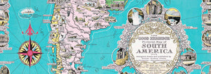
- Il buon vicino del Sudamerica Poster
- Italia con la Città del Vaticano Poster
- Cipolle Poster
- Ravanelli Poster
- Carote Poster
- Les Lalanne Poster
- Punch Boutique Poster
- Coppia danzante nella neve Poster
- Giudaismo e Paganesimo Poster
- Jet Clipper per le Hawaii Poster
- Campari Soda Poster
- Bec-Kina Poster
- Kohler Chocolat Poster
- Ladro di fragole Poster
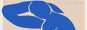
- Matisse Figure danzanti Poster
- Poster della mostra di Tom Krojer
- Scena di strada di Berlino Poster
- Mostra di Ernst Kirchner Poster
- Tour Eiffel 2 Poster
- Donna di spalle Poster
- Capelli rossi e cappello blu Poster
- Park Near Lu Poster
- El Comienzo Poster
- Parler Seul 2 Poster
- La posizione attuale dei Mahatmas Poster
- Twilight’s Ring Poster
- Parler Seul Poster
- Fauno e Ninfa Poster
- Il sogno Poster
- Le Concert Poster
- Artista femminile Poster
-
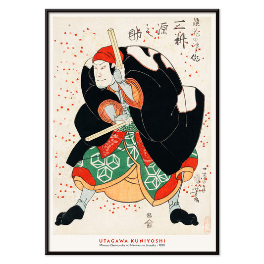
Mimasu Gennosuke Poster
Utagawa Kuniyoshi · 1830 · Drammatica stampa d'arte kabuki con motivi decisi e accenti rossi
Poster da CHF 9 · Incorniciato da CHF 16
Prezzo di listino Da CHF 6.00Prezzo di listino -
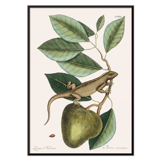
Guana Poster
Mark Catesby · 1754 · Elegante stampa di iguana su ramo con precisione scientifica
Poster da CHF 9 · Incorniciato da CHF 16
Prezzo di listino Da CHF 6.00Prezzo di listino -
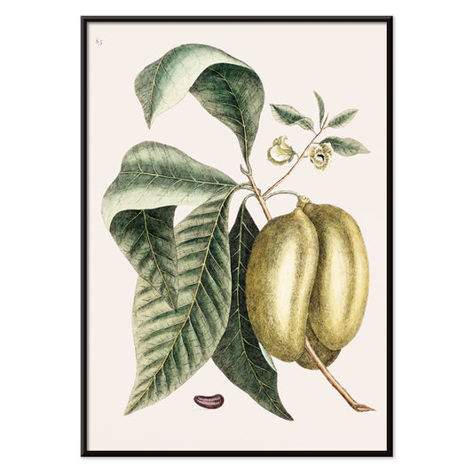
Pawpaw Poster
Mark Catesby · 1754 · Elegante stampa botanica di pawpaw con ampie foglie verdi e frutti maturi su fondo avorio
Poster da CHF 9 · Incorniciato da CHF 16
Prezzo di listino Da CHF 6.00Prezzo di listino -
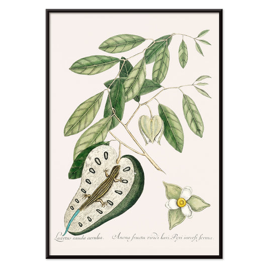
Lucertola dalla coda blu Poster
Mark Catesby · 1754 · Vivace stampa d'arte naturalistica di una lucertola con coda blu e posa raccolta
Poster da CHF 9 · Incorniciato da CHF 16
Prezzo di listino Da CHF 6.00Prezzo di listino -
Lucertola verde Poster
Mark Catesby · 1754 · Stampa d'arte vintage di storia naturale con una lucertola verde tra rami e foglie
Poster da CHF 9 · Incorniciato da CHF 16
Prezzo di listino Da CHF 6.00Prezzo di listino -
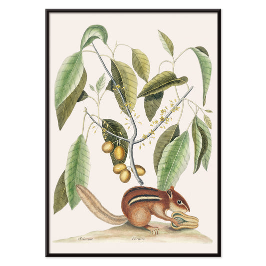
Scoiattolo terrestre Poster
Mark Catesby · 1754 · Stampa dettagliata di scoiattolo terrestre tra rami fogliosi su carta beige caldo
Poster da CHF 9 · Incorniciato da CHF 16
Prezzo di listino Da CHF 6.00Prezzo di listino -
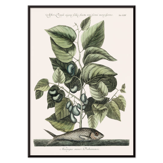
Sardina Poster
Mark Catesby · 1754 · Stampa vintage di sardina che accosta un pesce argenteo a vegetazione costiera
Poster da CHF 9 · Incorniciato da CHF 16
Prezzo di listino Da CHF 6.00Prezzo di listino -
Pesce globo Poster
Mark Catesby · 1754 · Elegante stampa di pesce globo con raffinato tratto a linee e tenui toni verdi della storia naturale
Poster da CHF 9 · Incorniciato da CHF 16
Prezzo di listino Da CHF 6.00Prezzo di listino -
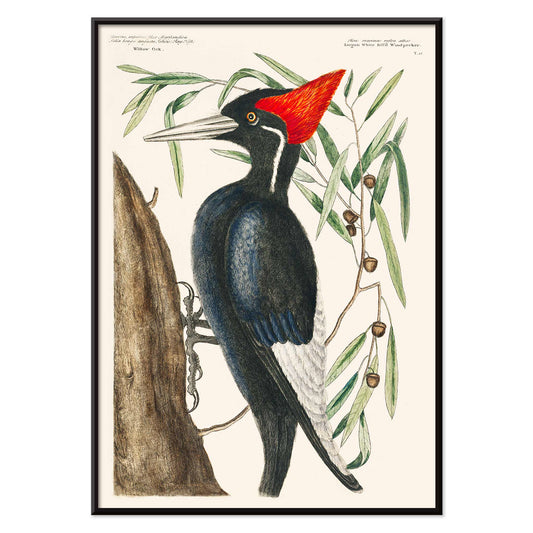
Picchio dal becco d'avorio Poster
Mark Catesby · 1754 · Stampa colorata a mano che ritrae un picchio dal becco d'avorio su un tronco
Poster da CHF 9 · Incorniciato da CHF 16
Prezzo di listino Da CHF 6.00Prezzo di listino -
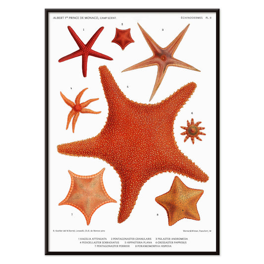
Varietà di stelle marine n. 3 Poster
Albert I · 1885 · Stampa vintage dettagliata di stelle marine disposte come tavola di storia naturale in toni corallo
Poster da CHF 9 · Incorniciato da CHF 16
Prezzo di listino Da CHF 6.00Prezzo di listino -
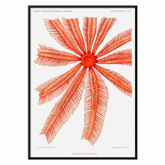
Brisingidae Poster
Albert I · 1898 · Stampa scientifica suggestiva della Brisingidae con braccia raggianti in toni corallo e rossi
Poster da CHF 9 · Incorniciato da CHF 16
Prezzo di listino Da CHF 6.00Prezzo di listino -
Vogue Poster
George Plank · 1921 · poster Vogue ottimista con figura stilizzata che si protende verso il sole
Poster da CHF 9 · Incorniciato da CHF 16
Prezzo di listino Da CHF 6.00Prezzo di listino -
Emisfero Occidentale Poster
Rand McNally & Co · 1940 · Dettagliato poster dell'Emisfero Occidentale con griglie nitide e mari blu nautici
Poster da CHF 9 · Incorniciato da CHF 16
Prezzo di listino Da CHF 6.00Prezzo di listino -
Corso di orientamento militare Poster
F.E. Manning · 1940 · Poster didattico della Seconda Guerra Mondiale con mappamondo e forte motivo a bersaglio su Berlino in blu
Poster da CHF 9 · Incorniciato da CHF 16
Prezzo di listino Da CHF 6.00Prezzo di listino -
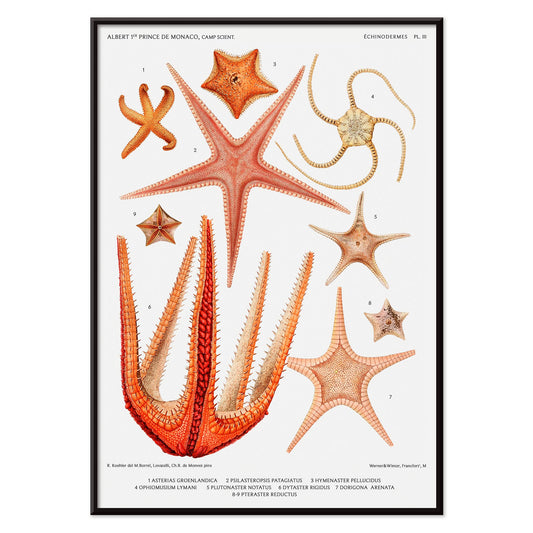
Varietà di stelle marine n. 1 Poster
Albert I · 1892 · Stampa scientifica dettagliata di stelle marine disposte come in una tavola di riferimento museale
Poster da CHF 9 · Incorniciato da CHF 16
Prezzo di listino Da CHF 6.00Prezzo di listino -
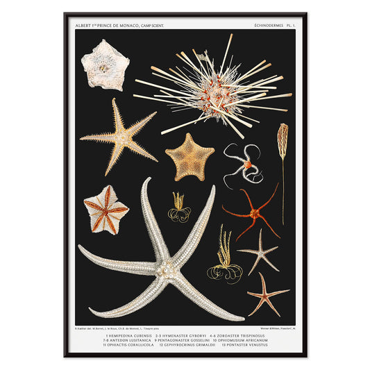
Varietà di stelle marine 2 Poster
Albert I · 1892 · Stampa scientifica dettagliata di stelle marine disposte come tavola comparativa in toni corallo
Poster da CHF 9 · Incorniciato da CHF 16
Prezzo di listino Da CHF 6.00Prezzo di listino -
Un colore Poster
Michael Mabry · 1987 · Poster grafico geometrico che bilancia un unico campo rosso deciso con tipografia nera nitida
Poster da CHF 9 · Incorniciato da CHF 16
Prezzo di listino Da CHF 6.00Prezzo di listino -
Coro Penn State Poster
Lanny Sommese · 1980 · Vivace poster coro Penn State con motivo a fiore formato da note musicali
Poster da CHF 9 · Incorniciato da CHF 16
Prezzo di listino Da CHF 6.00Prezzo di listino -
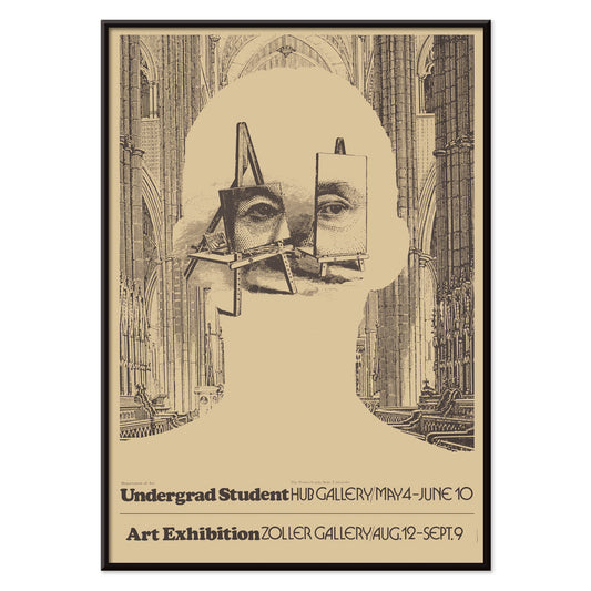
Mostra d'arte studenti universitari Poster
Lanny Sommese · 1979 · Surreale poster espositivo in nero e beige con silhouette di cattedrale formata da cavalletti
Poster da CHF 9 · Incorniciato da CHF 16
Prezzo di listino Da CHF 6.00Prezzo di listino -
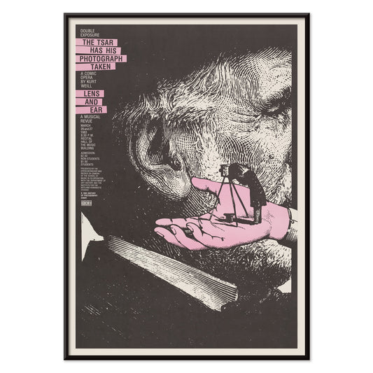
Il Zar si fa fotografare Poster
Lanny Sommese · 1983 · Poster surreale e concettuale con orecchio sovradimensionato e piccolo fotografo in forte contrasto
Poster da CHF 9 · Incorniciato da CHF 16
Prezzo di listino Da CHF 6.00Prezzo di listino -
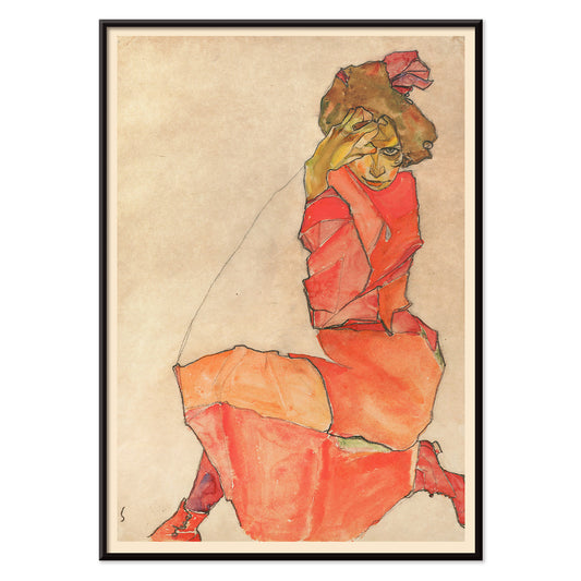
Donna in abito arancione e rosso Poster
Egon Schiele · 1910 · Stampa d'arte espressiva di figura con donna inginocchiata in abito arancione e rosso
Poster da CHF 9 · Incorniciato da CHF 16
Prezzo di listino Da CHF 6.00Prezzo di listino -
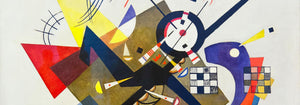
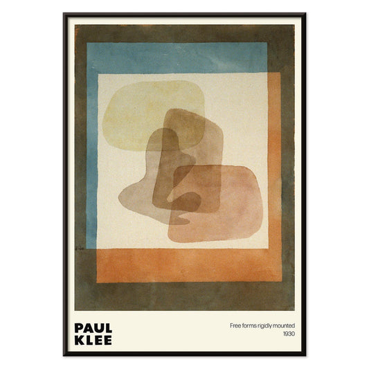
Forme libere Poster
Paul Klee · 1930 · Giocoso poster astratto di geometrie libere con accenti blu e arancione
Poster da CHF 9 · Incorniciato da CHF 16
Prezzo di listino Da CHF 6.00Prezzo di listino -
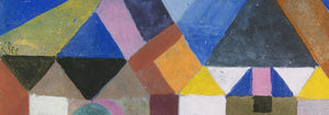
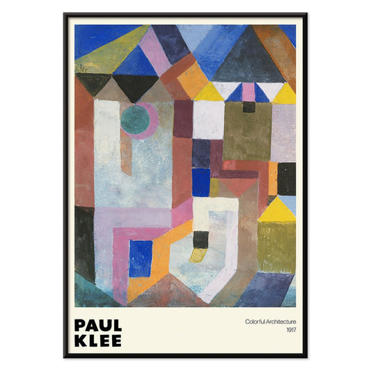
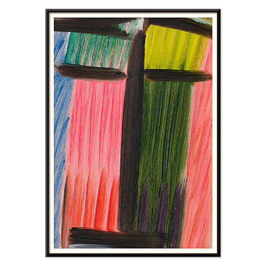
Architettura colorata Poster
Paul Klee · 1917 · Poster di architettura giocosa con blocchi vivaci blu rosa e giallo
Poster da CHF 9 · Incorniciato da CHF 16
Prezzo di listino Da CHF 6.00Prezzo di listino -
Fiori 2 Poster
Karl Blossfeldt · 1928 · Studio scultoreo di una pianta, stampa in bianco e nero nitida con chiarezza modernista
Poster da CHF 9 · Incorniciato da CHF 16
Prezzo di listino Da CHF 6.00Prezzo di listino -
Fiori 1 Poster
Karl Blossfeldt · 1928 · Stampa floreale scultorea in bianco e nero con chiarezza scientifica ed estetica
Poster da CHF 9 · Incorniciato da CHF 16
Prezzo di listino Da CHF 6.00Prezzo di listino -
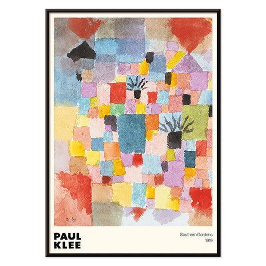
Giardini del Sud Poster
Paul Klee · 1919 · Poster geometrico vivace con blocchi ritmici di rosso, blu, giallo e verde
Poster da CHF 9 · Incorniciato da CHF 16
Prezzo di listino Da CHF 6.00Prezzo di listino -
Meditazione Poster
Alexej von Jawlensky · 1937 · Stampa d'arte meditativa con contorni neri decisi e toni vivaci rosa, blu e verde
Poster da CHF 9 · Incorniciato da CHF 16
Prezzo di listino Da CHF 6.00Prezzo di listino -
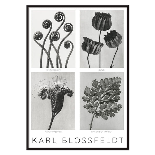
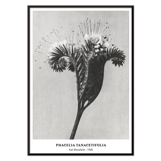
Phacelia tanacetifolia Poster
Karl Blossfeldt · 1928 · Studio scultoreo di Phacelia in stampa d'arte monocromatica, dettagli nitidi e curve ritmiche
Poster da CHF 9 · Incorniciato da CHF 16
Prezzo di listino Da CHF 6.00Prezzo di listino -
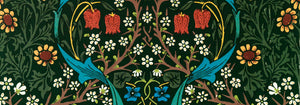
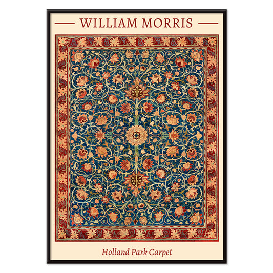
Holland Park Carpet Poster
William Morris · 1856 · Poster ornamentale con fiori, viti ritmiche e medaglioni in blu e rosso
Poster da CHF 9 · Incorniciato da CHF 16
Prezzo di listino Da CHF 6.00Prezzo di listino -
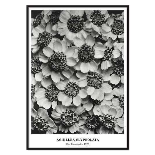
Achillea Clypeolata Poster
Karl Blossfeldt · 1928 · Stampa scultorea di achillea in nitido bianco e nero con simmetria architettonica
Poster da CHF 9 · Incorniciato da CHF 16
Prezzo di listino Da CHF 6.00Prezzo di listino -
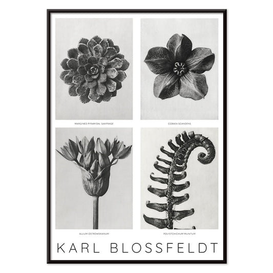
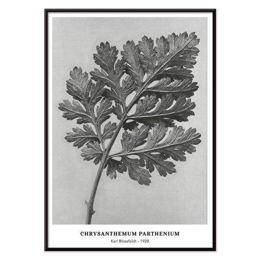
Chrysanthemum parthenium Poster
Karl Blossfeldt · 1928 · Stampa monocromatica di foglia di Chrysanthemum parthenium che equilibra rigore scientifico e suggestione scultorea
Poster da CHF 9 · Incorniciato da CHF 16
Prezzo di listino Da CHF 6.00Prezzo di listino -
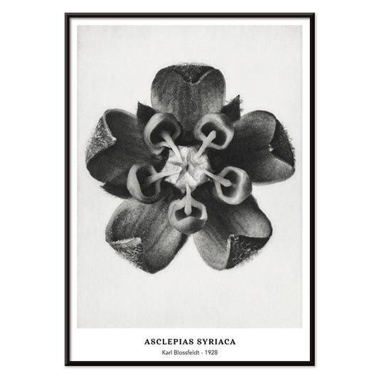
Asclepias syriaca Poster
Karl Blossfeldt · 1928 · Scultorea stampa bianco-e-nero di Asclepias che evidenzia boccioli geometrici su sfondo di studio pulito
Poster da CHF 9 · Incorniciato da CHF 16
Prezzo di listino Da CHF 6.00Prezzo di listino -
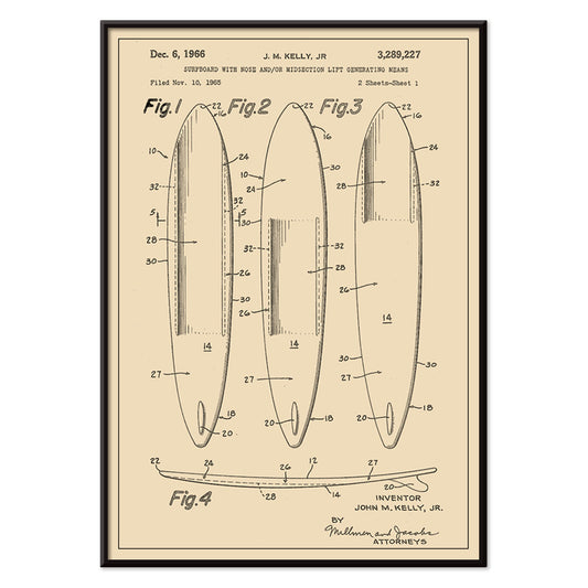
Brevetto di tavola da surf Poster
J.M. Kelly · 1935 · Poster tecnico di tavola da surf con linee nitide, dettagli numerati e fascino vintage
Poster da CHF 9 · Incorniciato da CHF 16
Prezzo di listino Da CHF 6.00Prezzo di listino -
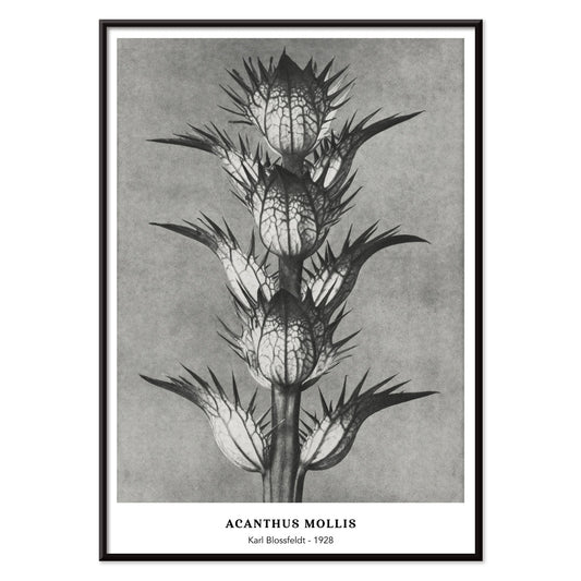
Acanthus mollis Poster
Karl Blossfeldt · 1928 · Scultorea stampa d'acanto in monocromo dal dettaglio netto e atmosfera museale
Poster da CHF 9 · Incorniciato da CHF 16
Prezzo di listino Da CHF 6.00Prezzo di listino -
Brevetto per flauto Poster
D. Julliot · 1908 · Dettagliata stampa vintage di brevetto per flauto con schemi nitidi e carta beige d'archivio
Poster da CHF 9 · Incorniciato da CHF 16
Prezzo di listino Da CHF 6.00Prezzo di listino -
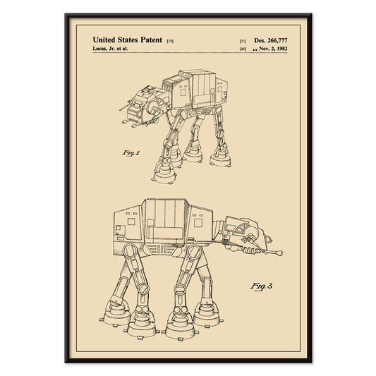
Star Wars AT-AT Brevetto Poster
George Lucas · 1981 · Poster in stile blueprint dell'AT-AT con diagrammi multivista su caldo beige
Poster da CHF 9 · Incorniciato da CHF 16
Prezzo di listino Da CHF 6.00Prezzo di listino


36/1512 items
- Mimasu Gennosuke Poster
- Varietà di stelle marine n. 3 Poster
- Brisingidae Poster
- Vogue Poster
- Corso di orientamento militare Poster
- Varietà di stelle marine n. 1 Poster
- Varietà di stelle marine 2 Poster
- Un colore Poster
- Il Zar si fa fotografare Poster
- Donna in abito arancione e rosso Poster
- Forme libere Poster
- Architettura colorata Poster
- Giardini del Sud Poster
- Meditazione Poster
- Phacelia tanacetifolia Poster
- Achillea Clypeolata Poster
- Chrysanthemum parthenium Poster
- Asclepias syriaca Poster
- Brevetto di tavola da surf Poster
- Brevetto per flauto Poster
- Star Wars AT-AT Brevetto Poster
Perché i poster verticali cambiano una stanza
Un poster verticale funziona come un elemento architettonico: conduce lo sguardo verso l'alto, riduce il rumore visivo e dà proporzione agli ambienti piccoli. Il formato ritratto è da sempre usato per manifesti teatrali, copertine di libri e avvisi di strada, dove il rettangolo alto favorisce una lettura dall'alto in basso. Come arte murale, la stessa struttura stabilizza interni affollati e rende gli spazi di passaggio più composti. È un formato utile per ingressi, corridoi e la striscia sottile tra finestra e mensola, dove una stampa orizzontale potrebbe apparire interrotta.
Un patrimonio grafico che educa lo sguardo
Il formato verticale è cresciuto in vista pubblica. Annunci di viaggio, programmi cinematografici e litografia commerciale hanno addestrato i designer a gestire la gerarchia con precisione: headline, immagine, testi piccoli, il tutto bilanciato da margini. I migliori poster vintage portano oggi quella disciplina, siano essi tipografici o puramente pittorici. Campi di colore piatti e contorni netti aiutano la composizione a essere leggibile da lontano, mentre la trama della carta e la densità dell'inchiostro regalano ricchezza a distanza ravvicinata. La stessa logica si collega naturalmente alla chiarezza del Bauhaus, alle forme ridotte del design Minimalista e alla robusta scaffalatura tonale delle immagini Bianco e Nero.
Posizionare l'arte in formato ritratto stanza per stanza
In soggiorno una stampa alta funziona bene accanto a una libreria, un mobile o una lampada da terra, dove riecheggia i verticali già presenti nell'arredo. In camera da letto i poster ritratto si adagiano nella sottile fascia tra armadio e porta o come accento singolo spostato rispetto al letto, invece che centrato sopra la testiera. Cucine e nicchie per la colazione prediligono spesso pezzi grafici vintage, specialmente layout ispirati alle etichette della collezione Pubblicità, mentre studi botanici più tranquilli dalla collezione Botanica ammorbidiscono superfici dure come piastrelle e acciaio. Per il colore, tratta il poster come nota d'accento: riprendi una tinta dall'inchiostro nei tessili o nella ceramica, mantenendo parete e finiture della cornice sobrie perché il rettangolo legga pulito.
Accoppiamenti, cornici e ritmo della parete galleria
I formati verticali sono più semplici da vivere se curati a coppie: un foglio ricco di dettagli accanto a uno più calmo in modo che la parete alterni dettaglio e pausa. Un terzo elemento può allargare la composizione, per esempio un punto di contrasto orizzontale tratto da Paesaggi, ma mantieni spaziatura costante perché l'insieme appaia studiato. Cornici nere sottili affilano i progetti grafici; rovere o noce danno calore alle immagini d'archivio, con opzioni coordinate nella sezione Cornici. Usa un passe-partout stretto per dare respiro alle stampe più scure, specialmente nei formati minori, e appendi su una linea centrale condivisa all'altezza degli occhi lasciando i bordi superiori leggermente sfalsati per preservare il ritmo verticale.
La logica calma di un rettangolo alto
Le collezioni guidate dal formato restano flessibili: l'orientamento ritratto può ospitare foto architettoniche, studi simbolici, astrazione o tipografia vintage senza forzare un unico umore. Ciò che unisce questi poster è il modo in cui il taglio alto edita una scena, mantenendo gesto e spazio negativo in equilibrio. Quando l'arredo comincia a sembrare affollato, una singola stampa d'arte verticale pensata ripristina l'ordine più efficacemente di un gruppo. Trattata come un'apertura silenziosa sulla parete, lascia respirare la stanza offrendo comunque un punto focale chiaro.