


- Distruggi questa bestia folle Poster
- Il buon vicino del Sudamerica Poster
- Italia con la Città del Vaticano Poster
- Cipolle Poster
- Bec-Kina Poster
- Kohler Chocolat Poster
- Ladro di fragole Poster
- Poster della mostra di Tom Krojer
- Mostra di Ernst Kirchner Poster
- El Comienzo Poster
- Parler Seul 2 Poster
- Twilight’s Ring Poster
- Parler Seul Poster
- Fauno e Ninfa Poster
- Il sogno Poster
- Le Concert Poster
- Uccello che attraversa una nuvola Poster
- Artista femminile Poster
- Revenge of the Pink Panther Poster
- Donna e uccello di notte Poster
- Bauhaus 20 Poster
- Gru giapponese blu Poster
- Snoopy Come Home Poster
- Per Londra con Jet Clipper Poster
- Kyushu-Okinawa Poster
- Xerez Pedro Domecq Poster
- Balsam Aperitif Poster
- Burro Poster
- Crans-sur-Sierre Poster
- Monte Carlo Poster
- Birra e Sigaretta Poster
- Costa occidentale del Messico Poster
- Rita Gaufres Poster
- Ibisco Poster
-
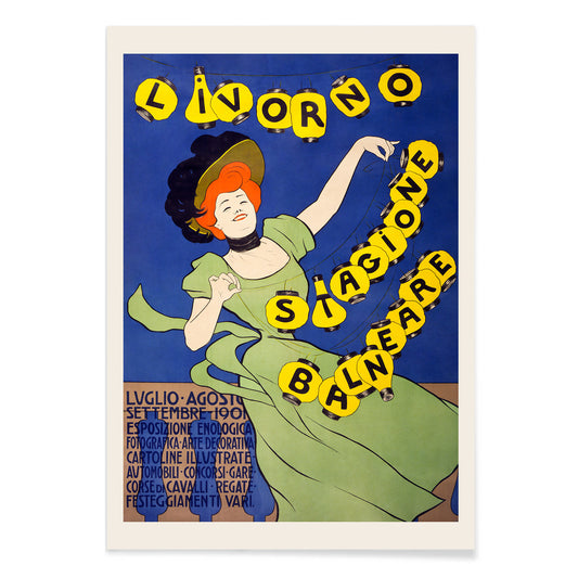
Livorno stagione balneare Poster
Leonetto Cappiello · 1901 · Vivace poster di mare con figura verde e lanterne luminose nella notte
Poster da CHF 9 · Incorniciato da CHF 16
Prezzo di listino Da CHF 6.00Prezzo di listino -
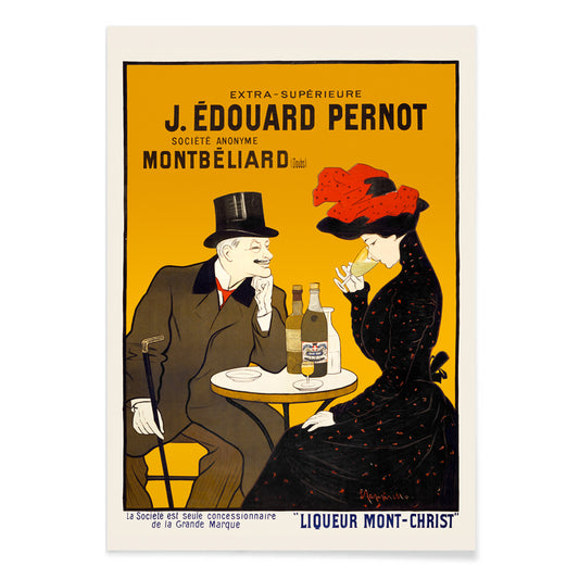
Uomo e donna al caffè Poster
Leonetto Cappiello · 1900 · Elegante poster di coppia al caffè con contrasto nero e accenti gialli e rossi
Poster da CHF 9 · Incorniciato da CHF 16
Prezzo di listino Da CHF 6.00Prezzo di listino -
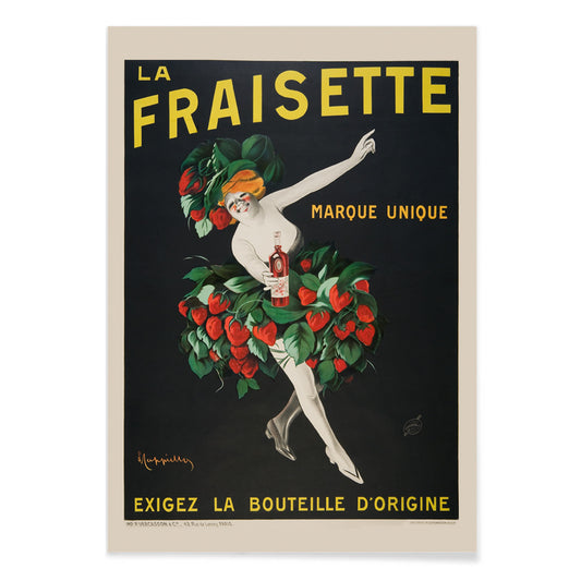
Fraisette Poster
Leonetto Cappiello · 1909 · Poster giocoso con figura in costume di fragola su sfondo nero con foglie verdi vibranti
Poster da CHF 9 · Incorniciato da CHF 16
Prezzo di listino Da CHF 6.00Prezzo di listino -
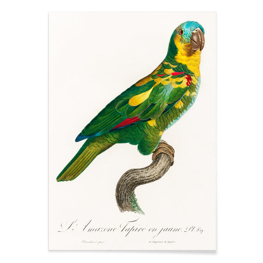
Amazzone dalla fronte turchese Poster
Francois Levaillant · 1803 · Stampa dettagliata di pappagallo con fronte turchese e penne verdi stratificate
Poster da CHF 9 · Incorniciato da CHF 16
Prezzo di listino Da CHF 6.00Prezzo di listino -
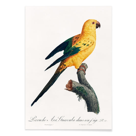
Conuro del sole Poster
Francois Levaillant · 1803 · Stampa radiosa del conuro del sole posato su un ramo con nitidi dettagli naturalistici
Poster da CHF 9 · Incorniciato da CHF 16
Prezzo di listino Da CHF 6.00Prezzo di listino -
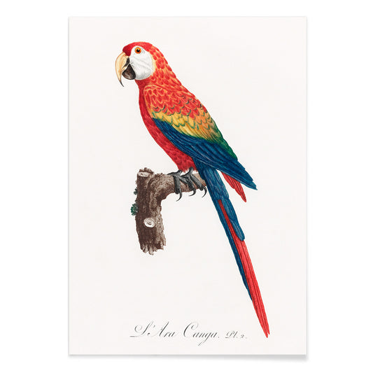
Ara Canga Poster
François Levaillant · 1803 · Vivace stampa d'arte Ara Canga con piumaggio scarlatto, ali blu e accenti gialli
Poster da CHF 9 · Incorniciato da CHF 16
Prezzo di listino Da CHF 6.00Prezzo di listino -
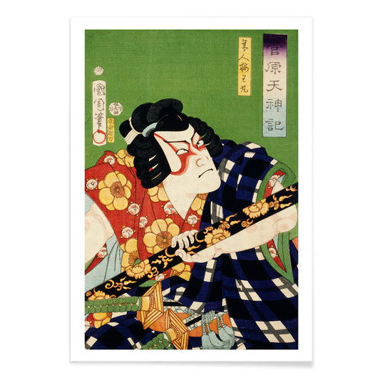
Ritratto di un attore in costume Poster
Toyohara Kunichika · 1870 · Stampa drammatica di attore kabuki con motivi di costume audaci e sguardo intenso
Poster da CHF 9 · Incorniciato da CHF 16
Prezzo di listino Da CHF 6.00Prezzo di listino -
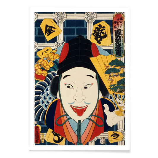
Ritratto di un attore Poster
Toyohara Kunichika · 1868 · Poster kabuki drammatico con trucco marcato, kimono a motivo e vividi campi cromatici
Poster da CHF 9 · Incorniciato da CHF 16
Prezzo di listino Da CHF 6.00Prezzo di listino -
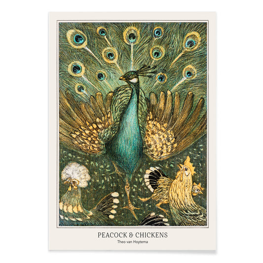
Pavone e polli Poster
Theo van Hoytema · 1878 · Elegante stampa d'arte con pavone vivace tra polli pacati in cortile
Poster da CHF 9 · Incorniciato da CHF 16
Prezzo di listino Da CHF 6.00Prezzo di listino -
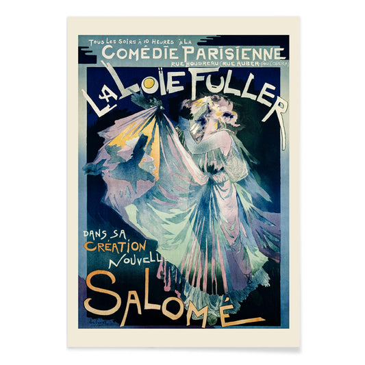
Comédie–Parisienne Poster
Georges de Feure · 1895 · Poster Art Nouveau di Loie Fuller con drappeggi scenici vorticosi e toni blu luminosi
Poster da CHF 9 · Incorniciato da CHF 16
Prezzo di listino Da CHF 6.00Prezzo di listino -
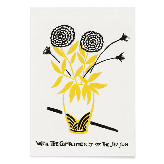
Con i complimenti della stagione Poster
Henry Lyman Sayen · 1918 · poster floreale stagionale con scritta decisa e mazzo luminoso su fondo scuro
Poster da CHF 9 · Incorniciato da CHF 16
Prezzo di listino Da CHF 6.00Prezzo di listino -
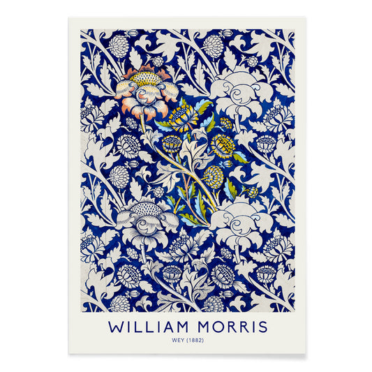
Wey Poster
William Morris · 1882 · Rigogliosa stampa Arts and Crafts con motivo floreale in toni freddi di blu e ritmo botanico vivace
Poster da CHF 9 · Incorniciato da CHF 16
Prezzo di listino Da CHF 6.00Prezzo di listino -
Grande sala del tempio di Karnak Poster
David Roberts · 1849 · Maestoso poster del tempio di Karnak con colonne svettanti e visitatori illuminati dal sole nella sala antica
Poster da CHF 9 · Incorniciato da CHF 16
Prezzo di listino Da CHF 6.00Prezzo di listino -
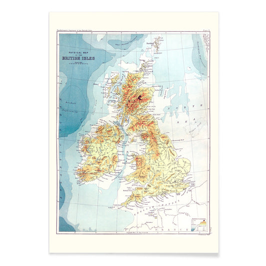
Gazetteer delle Isole Britanniche Poster
John Bartholomew · 1887 · Dettagliata stampa vintage delle Isole Britanniche con etichette nitide e impaginazione da atlante
Poster da CHF 9 · Incorniciato da CHF 16
Prezzo di listino Da CHF 6.00Prezzo di listino -
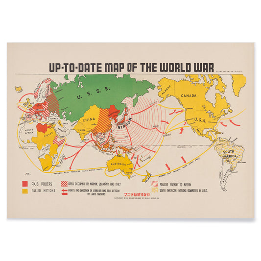
Mappa aggiornata della Seconda Guerra Mondiale Poster
Manila Shinbun-sha · 1942 · Dettagliata mappa della guerra mondiale in poster con rotte colorate e icone disegnate a mano
Poster da CHF 9 · Incorniciato da CHF 16
Prezzo di listino Da CHF 6.00Prezzo di listino -
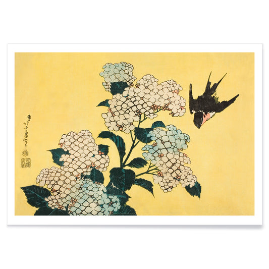
Ortensia e rondine Poster
Katsushika Hokusai · 1833 · Ariosa stampa di rondine e ortensie con linee nitide e luce estiva delicata
Poster da CHF 9 · Incorniciato da CHF 16
Prezzo di listino Da CHF 6.00Prezzo di listino -
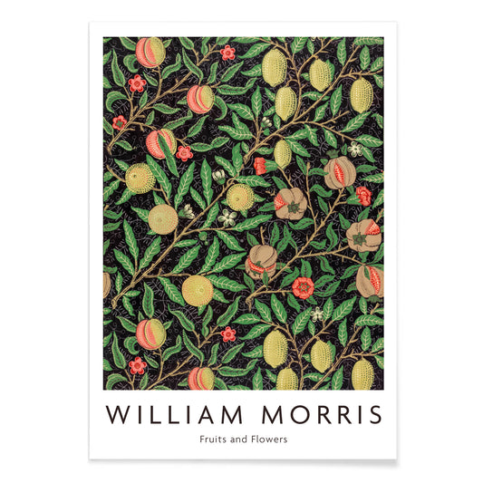
Motivo di frutta Poster
William Morris · 1862 · Ricca stampa a motivo di frutta e foglie con viti ritmiche su fondo scuro
Poster da CHF 9 · Incorniciato da CHF 16
Prezzo di listino Da CHF 6.00Prezzo di listino -
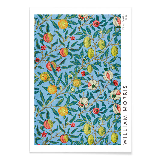
Quattro frutti Poster
William Morris · 1862 · Rigoglioso poster di frutti e fogliame con foglie intrecciate e fondi blu intensi
Poster da CHF 9 · Incorniciato da CHF 16
Prezzo di listino Da CHF 6.00Prezzo di listino -
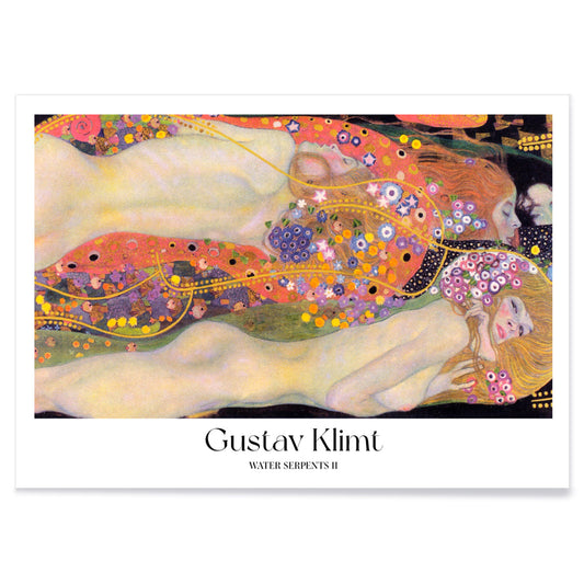
Serpenti d'acqua II Poster
Gustav Klimt · 1907 · Sensuale stampa d'arte Art Nouveau con ninfe acquatiche avvolte in oro, viola e corallo
Poster da CHF 9 · Incorniciato da CHF 16
Prezzo di listino Da CHF 6.00Prezzo di listino -
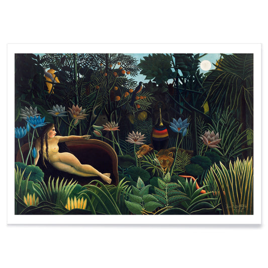
Il sogno Poster
Henri Rousseau · 1910 · Poster di giungla onirica con figura distesa, fogliame al chiaro di luna e animali attenti
Poster da CHF 9 · Incorniciato da CHF 16
Prezzo di listino Da CHF 6.00Prezzo di listino -
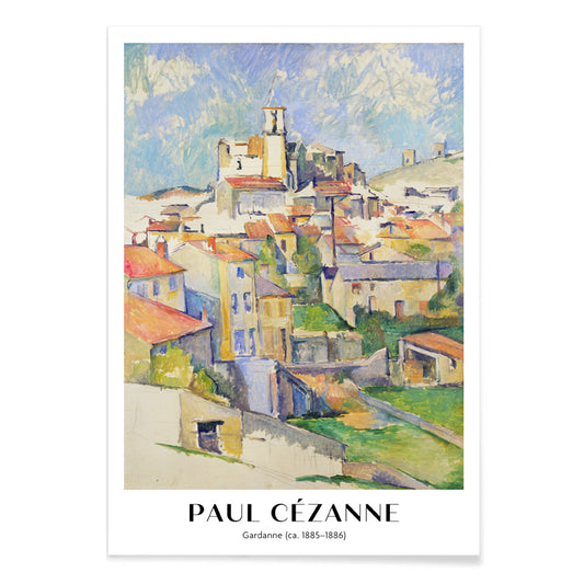
Gardanne Poster
Paul Cézanne · 1886 · Stampa d'arte di borgo provenzale con tetti in terracotta e cielo azzurro
Poster da CHF 9 · Incorniciato da CHF 16
Prezzo di listino Da CHF 6.00Prezzo di listino -
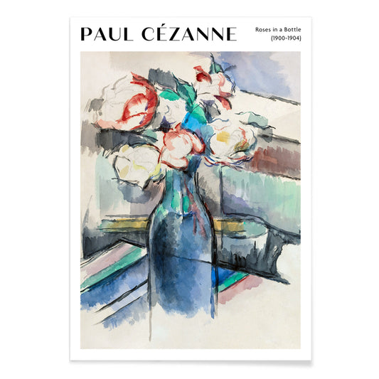
Rose in una bottiglia Poster
Paul Cézanne · 1902 · Luminose rose in bottiglia in stampa d'arte dai toni azzurri e verdi
Poster da CHF 9 · Incorniciato da CHF 16
Prezzo di listino Da CHF 6.00Prezzo di listino -
Ai piedi del Monte Ashitaka Poster
Hiroaki Takahashi · 1932 · Sereno poster paesaggistico fluviale con alberi dorati e monte blu in lontananza
Poster da CHF 9 · Incorniciato da CHF 16
Prezzo di listino Da CHF 6.00Prezzo di listino -
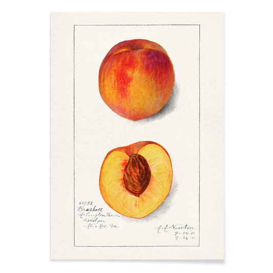
Pesca (Prunus persica) Poster
Amanda Almira Newton · 1911 · Delicata stampa botanica di pesca con frutto maturo e foglie morbide su sfondo bianco
Poster da CHF 9 · Incorniciato da CHF 16
Prezzo di listino Da CHF 6.00Prezzo di listino -
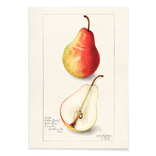
Pyrus communis Poster
Bertha Heiges · 1904 · Raffinata stampa botanica di pere mature con foglie verdi su sfondo bianco
Poster da CHF 9 · Incorniciato da CHF 16
Prezzo di listino Da CHF 6.00Prezzo di listino -
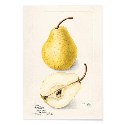
Pera Pyrus Communis 2 Poster
Amanda Almira Newton · 1908 · Delicata stampa botanica della pera in toni gialli con lieve sfumatura rossa e foglie nitide
Poster da CHF 9 · Incorniciato da CHF 16
Prezzo di listino Da CHF 6.00Prezzo di listino -
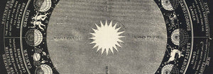
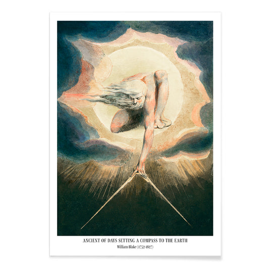
Ancient of Days Poster
William Blake · 1794 · Poster visionario di Urizen con disco solare fiammeggiante e bussola su blu notte
Poster da CHF 9 · Incorniciato da CHF 16
Prezzo di listino Da CHF 6.00Prezzo di listino -
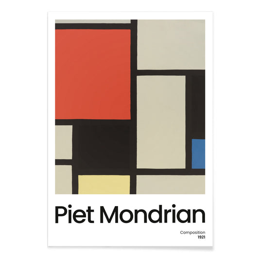
Composizione con grande piano rosso Poster
Piet Mondrian · 1921 · Stampa d'arte geometrica con grande piano rosso e netta griglia nera
Poster da CHF 9 · Incorniciato da CHF 16
Prezzo di listino Da CHF 6.00Prezzo di listino -
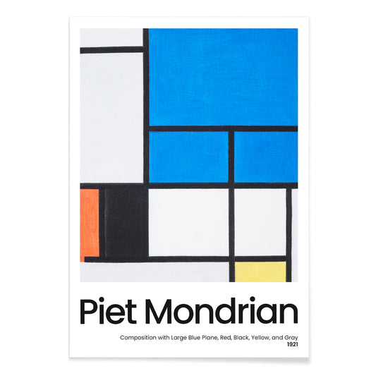
Composizione con grande piano blu Poster
Piet Mondrian · 1921 · Stampa d'arte geometrica De Stijl con grande piano blu e linee nere nette
Poster da CHF 9 · Incorniciato da CHF 16
Prezzo di listino Da CHF 6.00Prezzo di listino -
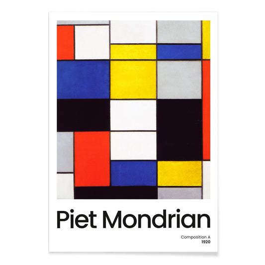
Composition A Poster
Piet Mondrian · 1920 · Geometrica stampa d'arte con griglia nera e campiture di colori primari su fondo bianco
Poster da CHF 9 · Incorniciato da CHF 16
Prezzo di listino Da CHF 6.00Prezzo di listino -
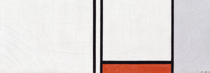
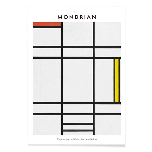
Composizione in bianco, rosso e giallo Poster
Pieter Cornelis Mondriaan · 1936 · Stampa d'arte geometrica che equilibra spazio bianco con linee nere nette e blocchi primari
Poster da CHF 9 · Incorniciato da CHF 16
Prezzo di listino Da CHF 6.00Prezzo di listino -
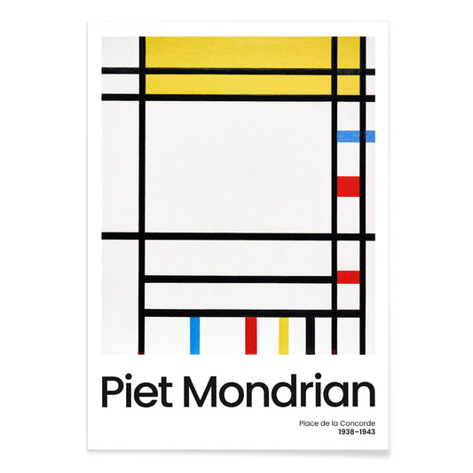
Place de la Concorde Poster
Piet Mondrian · 1941 · Poster geometrico che equilibra una griglia nera con campiture rosse, gialle e blu
Poster da CHF 9 · Incorniciato da CHF 16
Prezzo di listino Da CHF 6.00Prezzo di listino -
Senecio Poster
Paul Klee · 1922 · Poster geometrico a maschera con blocchi caldi arancione e giallo e sguardo saldo
Poster da CHF 9 · Incorniciato da CHF 16
Prezzo di listino Da CHF 6.00Prezzo di listino -
Motivo giapponese Poster
Albert-Charles-Auguste Racinet · 1888 · Vivace poster giapponese con motivi floreali intrecciati e geometrie dai colori intensi
Poster da CHF 9 · Incorniciato da CHF 16
Prezzo di listino Da CHF 6.00Prezzo di listino -
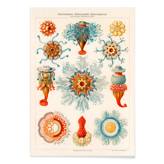
Illustrazione vintage di meduse Poster
Ernst Haeckel · 1904 · Stampa scientifica dettagliata di meduse con campane fluttuanti, margini frangiati e tentacoli
Poster da CHF 9 · Incorniciato da CHF 16
Prezzo di listino Da CHF 6.00Prezzo di listino -
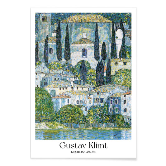
Chiesa di Cassone Poster
Gustav Klimt · 1913 · Luminosa stampa d'arte della chiesa sul lago con riflessi scintillanti e blocchi di colore mosaico
Poster da CHF 9 · Incorniciato da CHF 16
Prezzo di listino Da CHF 6.00Prezzo di listino


36/706 items
- Conuro del sole Poster
- Ara Canga Poster
- Ritratto di un attore in costume Poster
- Ritratto di un attore Poster
- Motivo di frutta Poster
- Quattro frutti Poster
- Il sogno Poster
- Ai piedi del Monte Ashitaka Poster
- Pesca (Prunus persica) Poster
- Composizione con grande piano rosso Poster
- Composizione in bianco, rosso e giallo Poster
- Place de la Concorde Poster
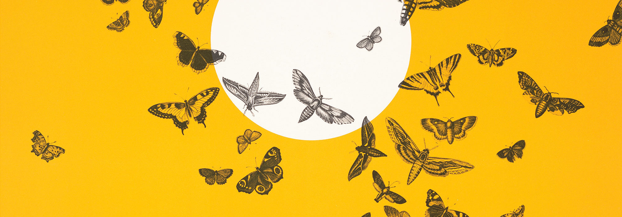
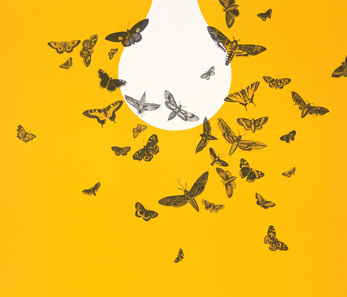
Un filo giallo nella storia dell'arte
Questa collezione non è una monocromia. Racconta il modo in cui il giallo si comporta quando entra in un'immagine: luce, segnale, ornamento, un rapido innalzamento di energia. Nei poster vintage cattura lo sguardo dalla strada; nella pittura moderna diventa struttura; nella storia naturale evoca polline, scorza e carte ingiallite dal tempo. Leggi questi poster e queste stampe come un vocabolario di calore, dai riflessi burrosi alle note elettriche che cambiano la temperatura dell'arte murale.
Oro, agrumi e la logica del colore
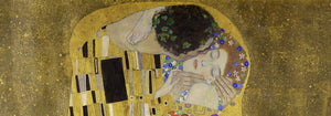
Poche opere mostrano il giallo come lusso e tecnica con la chiarezza di Gustav Klimt. Il Bacio (1907–1908) di Gustav Klimt fa sì che i gialli metallici si comportino come tessere, trasformando la pittura in superficie e la superficie in simbolo. All'altro estremo, il lavoro di Michel Eugène Chevreul su misurazione cromatica tratta la tinta come informazione misurabile, un diagramma scientifico che resta comunque decorativo. Insieme spiegano perché il giallo persiste attraverso le epoche: può segnalare opulenza, illuminazione o metodo, rendendo una stampa vintage al tempo stesso immediata e ragionata.
Usare accenti gialli nell'arredamento
Nell'arredamento il giallo funziona meglio quando ha un compito. Un corridoio stretto beneficia di un piccolo bagliore accanto a uno specchio; una cucina accoglie gialli che ricordano agrumi o cereali; uno studio può sostenere toni più netti e analitici. Abbina poster gialli a bianchi calcarei, noce e lino per un calore discreto, oppure ponili su verdi profondi e blu inchiostro per forte contrasto. Per misura e geometria, passa dal Minimalista all'Astratto; per rimandi naturali, la Botanica tiene il colore ancorato a steli, teste di seme e osservazione scientifica.
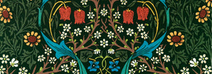
Curare una parete galleria con pattern e struttura
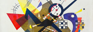
Nel costruire una parete galleria pensa a ritmi: pattern, griglia, poi una singola nota vivida. Il ladro di fragole (1883) di William Morris porta densità tessile e una logica da giardino che ammorbidisce l'arredo moderno. Equilibralo con Piet Mondrian: Composizione in Bianco, Rosso e Giallo (1936) di Piet Mondrian, dove il giallo è un piano misurato più che atmosfera. Aggiungi dinamismo controllato con Wassily Kandinsky: Cerchi in un cerchio, mostra Bauhaus (1923) di Wassily Kandinsky, ponte tra poster espositivo e pittura. Per estendere il mix, la Pubblicità sostiene tipografie più audaci, il Bauhaus stringe il linguaggio formale e l'Arte Classica introduce ancore tonali più quiete.
Perché il giallo sembra così presente
Spesso sottovalutato come semplice decorazione, il giallo è invece una strategia compositiva: guida lo sguardo, suggerisce la luce del sole, mappa un sistema. Appeso con intenzione, un piccolo passaggio giallo può far leggere i colori circostanti più puliti o più profondi, come se la luce della stanza fosse stata regolata senza toccare le lampade.