


-
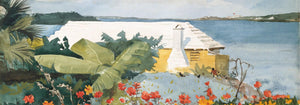
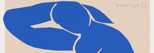
Real Club de Barcelona Poster
Joan Llaverias · 1902 · Refined sailing club poster with rhythmic sails and a breezy Barcelona seaside atmosphere
Poster from CHF 9 · Framed from CHF 16
Regular price From CHF 6.00Regular price -
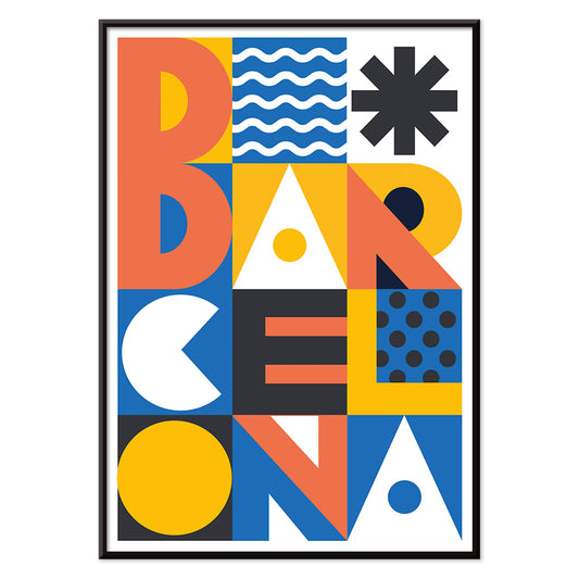
Barcelona Text poster Poster
MORYARTY · 2021 · Modern Barcelona poster with bold stacked typography and bright geometric color blocks
Poster from CHF 9 · Framed from CHF 16
Regular price From CHF 6.00Regular price -
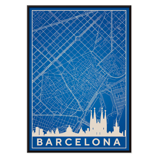
Map of Barcelona 2 Poster
MORYARTY · 2019 · Minimal blue and white Barcelona map poster pairing skyline outline with precise street lines
Poster from CHF 9 · Framed from CHF 16
Regular price From CHF 6.00Regular price -
View of Barcelona Poster
Unknown artist · 1563 · Panoramic Barcelona vintage print featuring fortified shoreline, sailing ships, and distant hills
Poster from CHF 9 · Framed from CHF 16
Regular price From CHF 6.00Regular price -
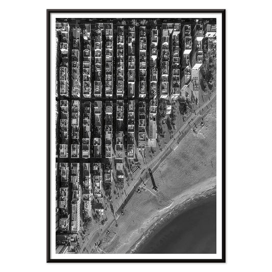
Barceloneta Poster
Unknown artist · 1992 · High-contrast aerial Barceloneta poster balancing tight city grids with open Mediterranean water
Poster from CHF 9 · Framed from CHF 16
Regular price From CHF 6.00Regular price -
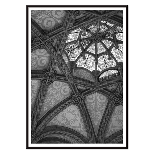
Hospital de Sant Pau Poster
Unknown artist · 1901 · Monochrome architectural poster capturing Sant Pau vaulted ceilings with dramatic light and shadow
Poster from CHF 9 · Framed from CHF 16
Regular price From CHF 6.00Regular price -
Billetes Bus Barcelona 2 Poster
Unknown artist · 1978 · Colorful Barcelona transit ticket vintage print with bold numbers and graphic accents
Poster from CHF 9 · Framed from CHF 16
Regular price From CHF 6.00Regular price -
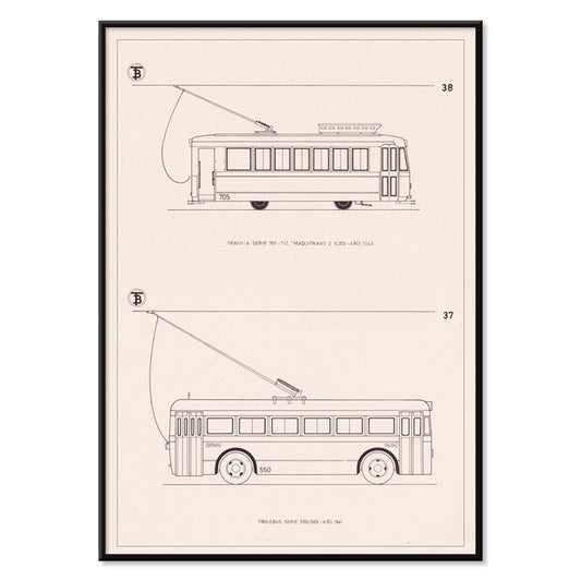
Tranvia Serie 701/712 Poster
Unknown artist · 1943 · Precise tram blueprint print with side and front elevations on warm beige paper
Poster from CHF 9 · Framed from CHF 16
Regular price From CHF 6.00Regular price -
Billetes de Bus de Barcelona Poster
Unknown artist · 1972 · Colorful Barcelona bus ticket poster arranged as a graphic grid of transit ephemera
Poster from CHF 9 · Framed from CHF 16
Regular price From CHF 6.00Regular price -
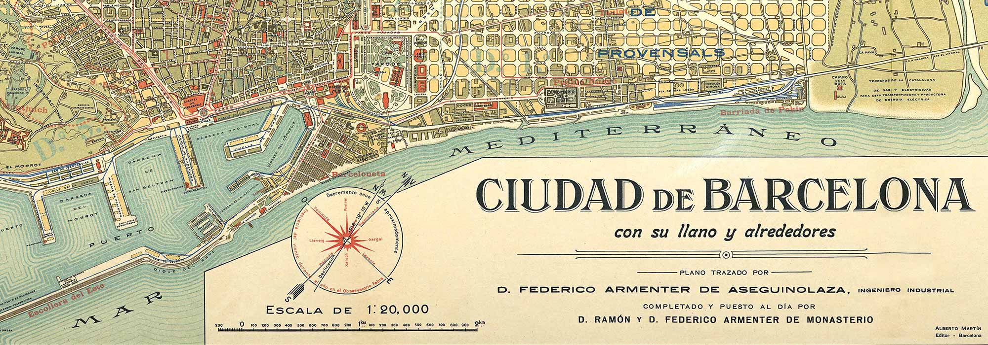
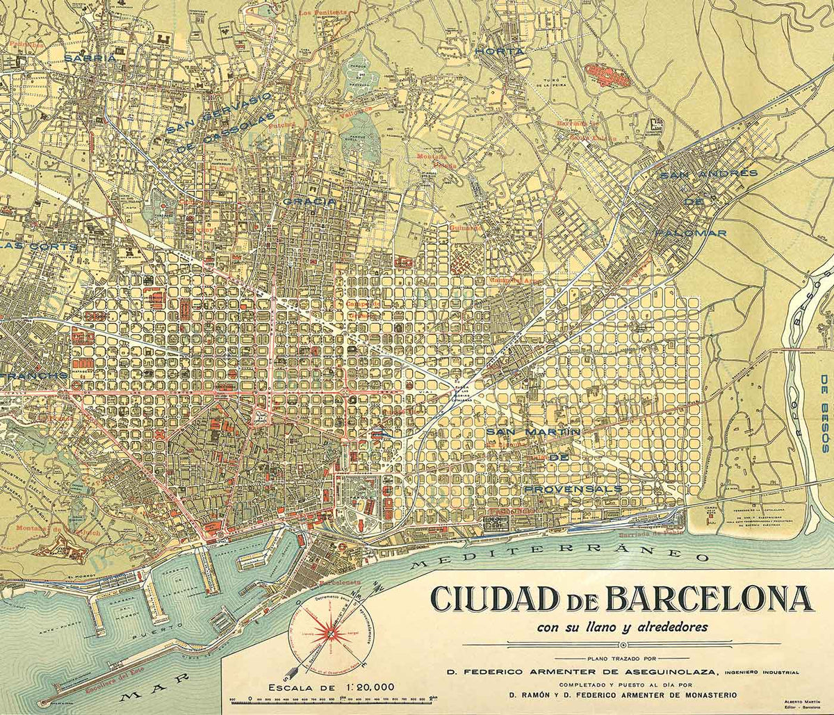
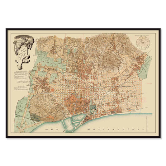
Plan of Barcelona and surroundings Poster
Unknown artist · 1890 · Barcelona map poster with sepia streets and coastal detail
Poster from CHF 9 · Framed from CHF 16
Regular price From CHF 6.00Regular price -
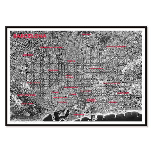
Barcelona satellite city map Poster
MORYARTY · 2026 · Barcelona satellite map poster with red district labels and coastline
Poster from CHF 9 · Framed from CHF 16
Regular price From CHF 6.00Regular price -
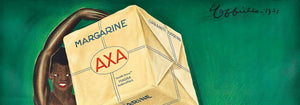
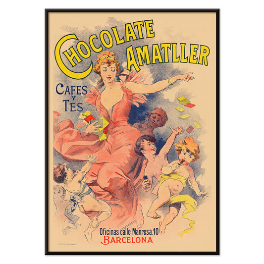
Chocolate Amatller poster Poster
Unknown artist · 1893 · Chocolate Amatller poster adds a lively vintage print to Barcelona-inspired interiors
Poster from CHF 9 · Framed from CHF 16
Regular price From CHF 6.00Regular price


Mediterranean geometry and Modernisme
Barcelona turns urban order into poetry: the Eixample grid, the curve of the coast, and Modernisme ornament catching salty light. This collection gathers poster and art print views that read like a walking itinerary of architecture, sea air, and graphic mapping, suited to wall art and vintage decoration. The city’s dual personality stays visible at every scale, from iron balconies to mosaic domes, from shaded arcades to beaches that stretch into a horizon line.
From civic craft to mass print culture
Look up in Hospital de Sant Pau stained glass ceiling, where repeating ribs and jewel tones turn a corridor into a public monument; it is a reminder that Modernisme was not only domestic luxury, but also a civic language. For a glimpse of early twentieth-century leisure, Real Club de Barcelona (1902) by Joan Llaverias shows how lithographic thinking shaped the period’s visual voice: flat color, confident contour, and lettering designed to be read at a distance. Between these poles sit map and type-driven works that treat the city as information, close in spirit to the rational clarity found in Maps and the pared-back decisions typical of Minimalist graphic design.
Placing Barcelona in a room
In an entry or hallway, a map-based print brings structure and calm, especially when paired with pale stone, oak, or terrazzo. In kitchens and dining spaces, coastal imagery echoes tile and enamel; an aerial shoreline view can connect naturally with watery palettes drawn from Sea & Ocean. If you prefer the city’s built rhythm over the beach, keep the palette architectural and borrow companions from Landscape, where horizon and structure share the same quiet logic. Hang travel wall art slightly lower than gallery height so it reads as a lived-in window rather than a label.
Curating a gallery wall with restraint
A Barcelona gallery wall works best when it avoids souvenir density. Pair one typographic or cartographic sheet with one atmospheric image, then repeat a single framing finish across the set for cohesion. The cinematic grain of Aerial view of Barceloneta sits comfortably beside photographic prints from Photo, especially in rooms with linen, light woods, and glass. Llaverias’s sailing poster can converse with period lettering and graphic ephemera from Advertising, where sport, commerce, and design history overlap. If the room already carries strong color, pull the set into line with black frames and generous margins, letting the drawing and coastline do the work in the spirit of Black & White selection-making.
The city as an image you can live with
Barcelona on paper shifts scale quickly: street logic and right angles give way to ornament, then return as signage, plans, and public decoration. That elasticity makes a single poster feel complete, while a trio can read as a compact travel archive rather than a themed display. In a home with terracotta, woven shades, or warm plaster, the vintage references fold in easily; in a more neutral interior, they act as a measured dose of place. Keep surrounding objects quiet and let blues, stone tones, and small flashes of stained-glass color carry the mood.