


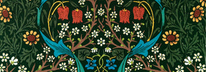


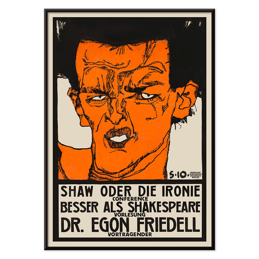
- Shaw or Irony Poster
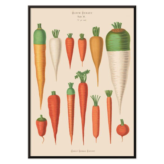
- Carrots Poster
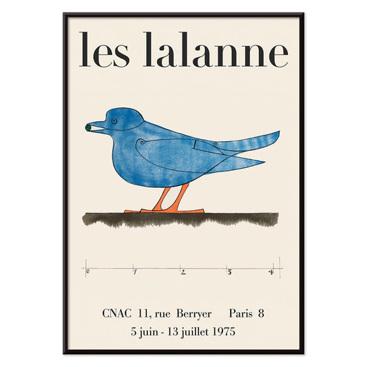
- Les Lalanne Poster
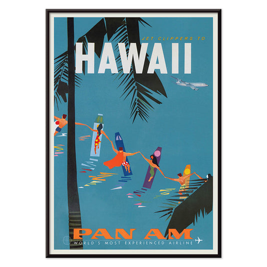
- Jet Clipper to Hawaii Poster
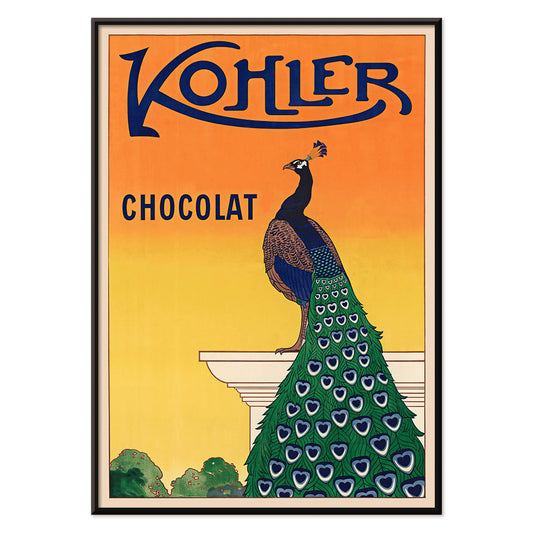
- Kohler Chocolat Poster
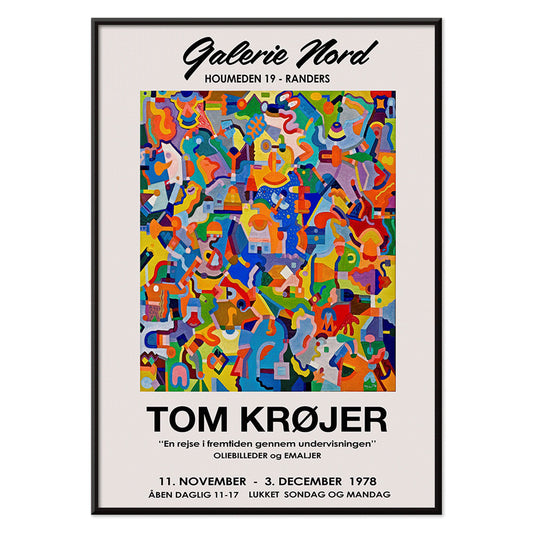
- Tom Krojer Exhibition Poster Poster
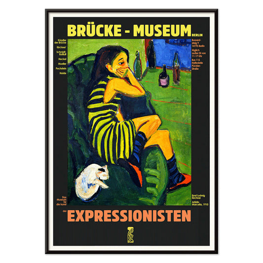
- Berlin Street Scene Poster
- Park Near Lu Poster
- Parler Seul 2 Poster
- Faun and Nymphe Poster
- The Dream Poster
- Le Concert Poster
- Female Artist Poster
- Revenge of the Pink Panther Poster
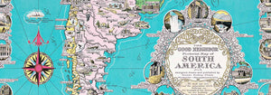
- Almanaque Poster
- Bauhaus 21 Poster
- The Jefferson Airplane Poster
- Butter Poster
- Pacific Vibrations Poster
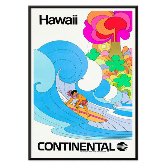
- Continental Hawaii Airline Poster
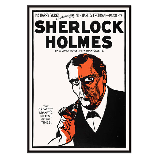
- Sherlock Holmes Poster
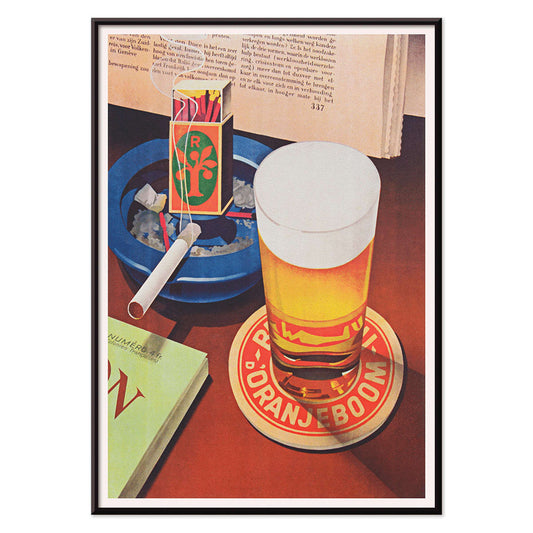
- Beer and Cigarette Poster
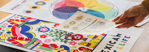
- Mexican Art & Life 4 Poster
- Mexican Art & Life 3 Poster
- Zug Schleife Poster
- 25th of April Bridge Poster
- Joyful Mountain Poster
- Colorations variées de la Lune Poster
- Le Floral Poster
- Tropical Flowers II Poster
- Flower Market Valencia Poster
- Morning at Dotonbori Poster
- Flower Market Lisbon Poster
- Flower Market Barcelona Poster
- British Overseas Airways Poster
- Orange cut outs Poster
-
Shaw or Irony Poster
Egon Schiele · 1910 · Expressive lecture poster with angular figure, black linework, and warm orange accents
Poster from CHF 9 · Framed from CHF 16
Regular price From CHF 6.00Regular price -
Carrots Poster
Ernst Benary · 1876 · Detailed botanical print of heirloom carrots with leafy tops on warm beige plate
Poster from CHF 9 · Framed from CHF 16
Regular price From CHF 6.00Regular price -
Les Lalanne Poster
François-Xavier Lalanne · 1975 · Minimal exhibition poster featuring a stylized blue bird on warm beige ground
Poster from CHF 9 · Framed from CHF 16
Regular price From CHF 6.00Regular price -
Jet Clipper to Hawaii Poster
Unknown artist · 1950 · Mid-century Hawaii travel poster blending aviation glamour with sunlit island leisure
Poster from CHF 9 · Framed from CHF 16
Regular price From CHF 6.00Regular price -
Kohler Chocolat Poster
F. Champenois · 1914 · Elegant Art Nouveau peacock poster advertising Kohler chocolate on a radiant orange background
Poster from CHF 9 · Framed from CHF 16
Regular price From CHF 6.00Regular price -
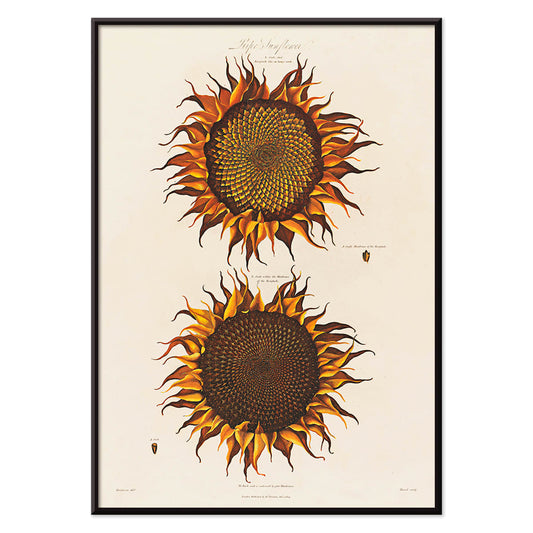
Ripe Sunflower Poster
Robert John Thornton · 1799 · Dramatic ripe sunflower botanical print with curling petals and lush green leaves
Poster from CHF 9 · Framed from CHF 16
Regular price From CHF 6.00Regular price -
Tom Krojer Exhibition Poster Poster
Tom Krojer · 1989 · Dynamic geometric exhibition poster balancing vivid color blocks with crisp modern typography
Poster from CHF 9 · Framed from CHF 16
Regular price From CHF 6.00Regular price -
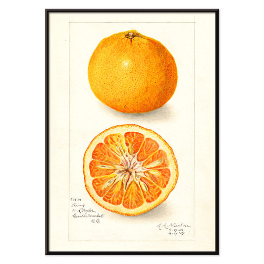
Citrus nobilis Poster
Amanda Almira Newton · 1908 · Detailed mandarin botanical print with clean negative space and warm orange tones
Poster from CHF 9 · Framed from CHF 16
Regular price From CHF 6.00Regular price -
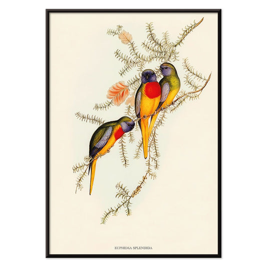
Euphema Splendida Poster
Unknown artist · 1848 · Detailed parakeet print with three birds perched among leafy branches
Poster from CHF 9 · Framed from CHF 16
Regular price From CHF 6.00Regular price -
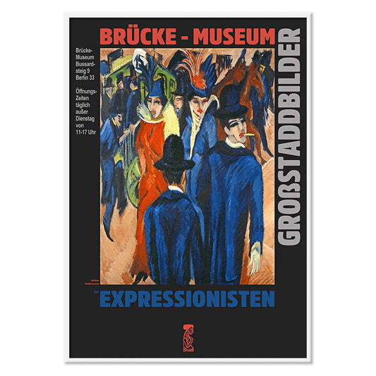
Berlin Street Scene Poster
Ernst Kirchner · 1913 · Dynamic Berlin street poster with angular figures, bright color blocks, and nightlife energy
Poster from CHF 9 · Framed from CHF 16
Regular price From CHF 6.00Regular price -
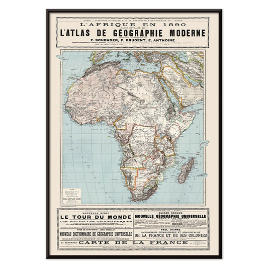
L'Afrique en 1890 Poster
Unknown artist · 1890 · Detailed Africa map poster with French labels and period boundary markings
Poster from CHF 9 · Framed from CHF 16
Regular price From CHF 6.00Regular price -
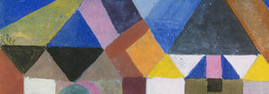
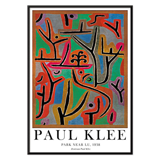
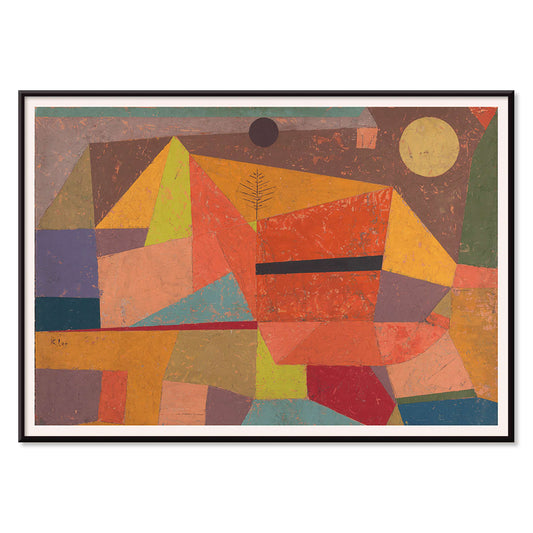
Park Near Lu Poster
Paul Klee · 1938 · Dreamlike abstract landscape art print with rhythmic blocks suggesting a quiet park
Poster from CHF 9 · Framed from CHF 16
Regular price From CHF 6.00Regular price -
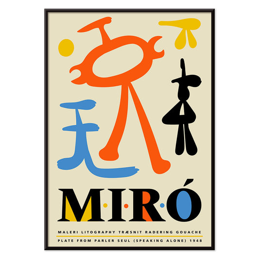
Parler Seul 2 Poster
Joan Miro · 1948 · Playful biomorphic poster with floating black lines and orange, blue, yellow accents on beige
Poster from CHF 9 · Framed from CHF 16
Regular price From CHF 6.00Regular price -
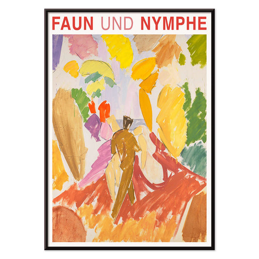
Faun and Nymphe Poster
Edvard Weie · 1941 · Expressive mythic poster pairing a faun and nymph in bold modernist color blocks
Poster from CHF 9 · Framed from CHF 16
Regular price From CHF 6.00Regular price -
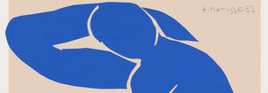
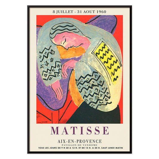
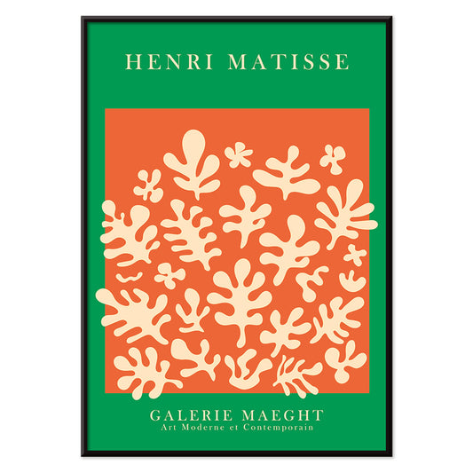
The Dream Poster
Henri Matisse · 1960 · Vibrant sleeping figure poster with flowing contours and bold, flat color shapes
Poster from CHF 9 · Framed from CHF 16
Regular price From CHF 6.00Regular price -
Le Concert Poster
Hulusi Mercan · 1960 · Energetic abstract poster of musical instruments with bold red blue and yellow shapes
Poster from CHF 9 · Framed from CHF 16
Regular price From CHF 6.00Regular price -
Female Artist Poster
Ernst Ludwig Kirchner · 1910 · Angular figure art print with bold black contours and high-contrast color fields
Poster from CHF 9 · Framed from CHF 16
Regular price From CHF 6.00Regular price -
Revenge of the Pink Panther Poster
Unknown artist · 1978 · Playful Pink Panther movie poster with regal throne pose and bold retro colors
Poster from CHF 9 · Framed from CHF 16
Regular price From CHF 6.00Regular price -
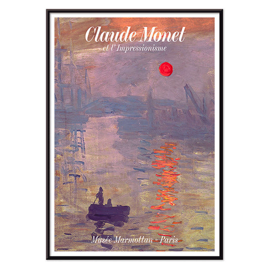
Soleil Levant Poster
Claude Monet · 1872 · Misty harbor sunrise poster with orange sun and blue-grey water reflections
Poster from CHF 9 · Framed from CHF 16
Regular price From CHF 6.00Regular price -
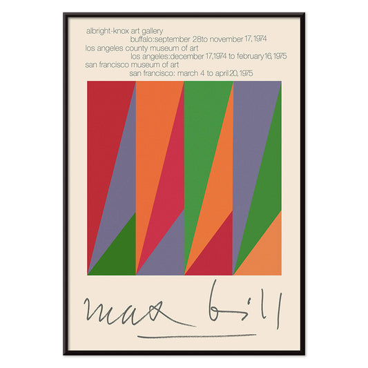
Max Bill Poster
Max Bill · 1974 · Geometric abstract poster with interlocking forms in vivid red, orange, green, and purple
Poster from CHF 9 · Framed from CHF 16
Regular price From CHF 6.00Regular price -
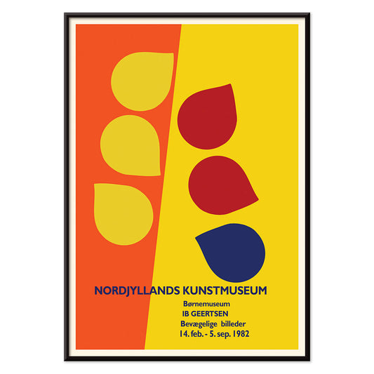
Ib Geertsen Poster
Ib Geertsen · 1982 · Vibrant geometric poster balancing bold primary blocks with crisp Scandinavian modernism
Poster from CHF 9 · Framed from CHF 16
Regular price From CHF 6.00Regular price -
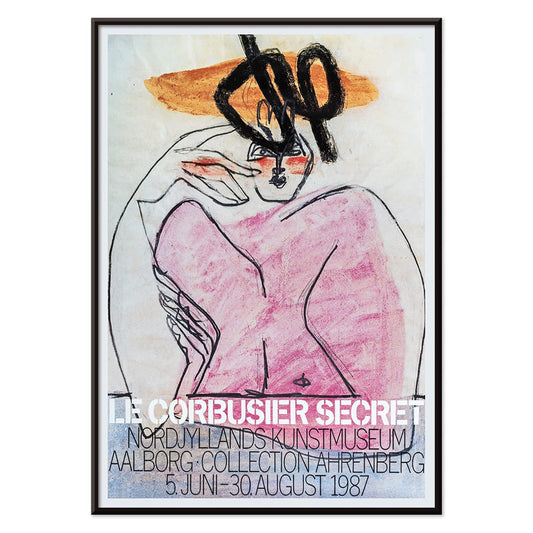
Secret Poster
Le Corbusier · 1987 · Enigmatic abstract poster with bold black lines and pink, orange, and blue blocks
Poster from CHF 9 · Framed from CHF 16
Regular price From CHF 6.00Regular price -
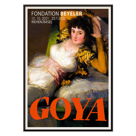
The Clothed Maja Poster
Francisco Goya · 1802 · Iconic reclining figure art print with crisp whites, green sash, and golden cushions
Poster from CHF 9 · Framed from CHF 16
Regular price From CHF 6.00Regular price -
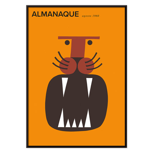
Almanaque Poster
Sebastiao Rodrigues · 1960 · Abstract lion poster with bold orange and black geometry in a mid-century style
Poster from CHF 9 · Framed from CHF 16
Regular price From CHF 6.00Regular price -
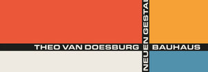
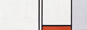
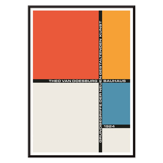
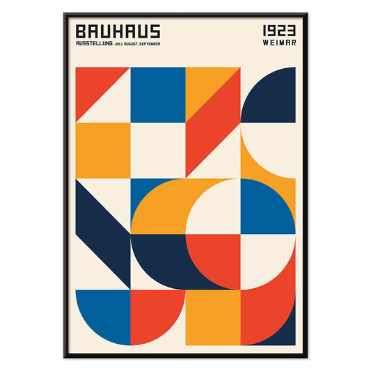
Bauhaus 21 Poster
Unknown artist · 1924 · Geometric Bauhaus poster with orange circle, blue block, and crisp black lines
Poster from CHF 9 · Framed from CHF 16
Regular price From CHF 6.00Regular price -
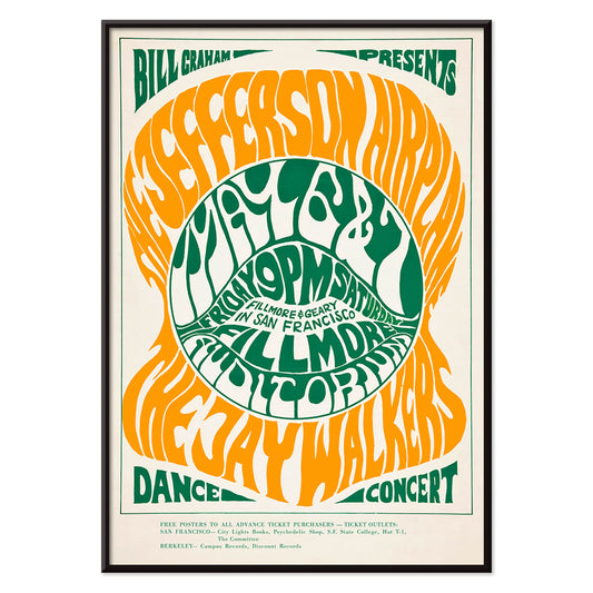
The Jefferson Airplane Poster
Wes Wilson · 1966 · Psychedelic Jefferson Airplane poster with swirling typography and vivid green-orange contrast
Poster from CHF 9 · Framed from CHF 16
Regular price From CHF 6.00Regular price -
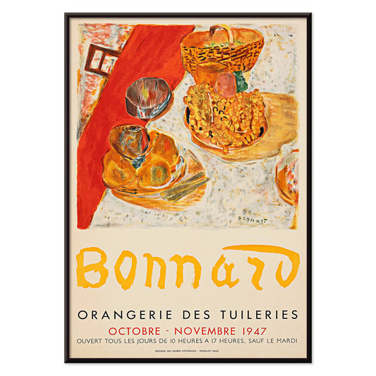
Exposition Bonnard Poster
Unknown artist · 1947 · Sunlit still life poster balancing bold color blocks and elegant exhibition typography
Poster from CHF 9 · Framed from CHF 16
Regular price From CHF 6.00Regular price -
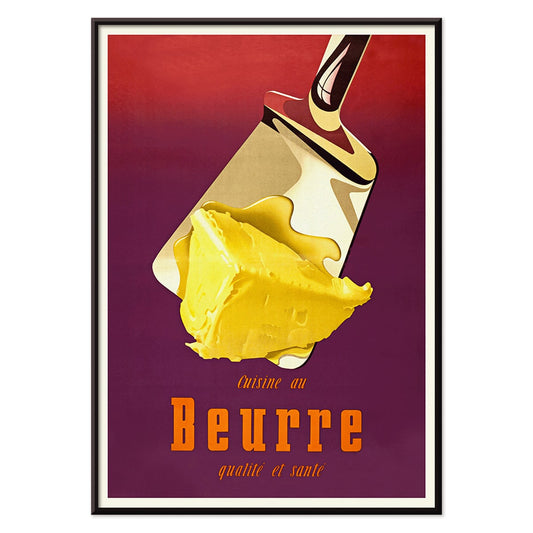
Butter Poster
Donald Brun · 1951 · Playful butter poster with smooth airbrushed shading and bold mid-century Swiss clarity
Poster from CHF 9 · Framed from CHF 16
Regular price From CHF 6.00Regular price -
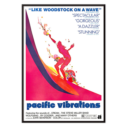
Pacific Vibrations Poster
Unknown artist · 1970 · Vibrant surfer poster featuring dynamic figures in ocean blue with warm pink and orange accents
Poster from CHF 9 · Framed from CHF 16
Regular price From CHF 6.00Regular price -
Continental Hawaii Airline Poster
Unknown artist · 1960 · Joyful Hawaii surf poster with lei-wearing surfer and psychedelic flower backdrop
Poster from CHF 9 · Framed from CHF 16
Regular price From CHF 6.00Regular price -
Sherlock Holmes Poster
Unknown artist · 1901 · Dramatic Sherlock Holmes poster featuring pipe and deerstalker in stark black, white, orange
Poster from CHF 9 · Framed from CHF 16
Regular price From CHF 6.00Regular price -
Beer and Cigarette Poster
Unknown artist · 1935 · Graphic beer and cigarette poster featuring a foaming glass and bold red and blue accents
Poster from CHF 9 · Framed from CHF 16
Regular price From CHF 6.00Regular price -
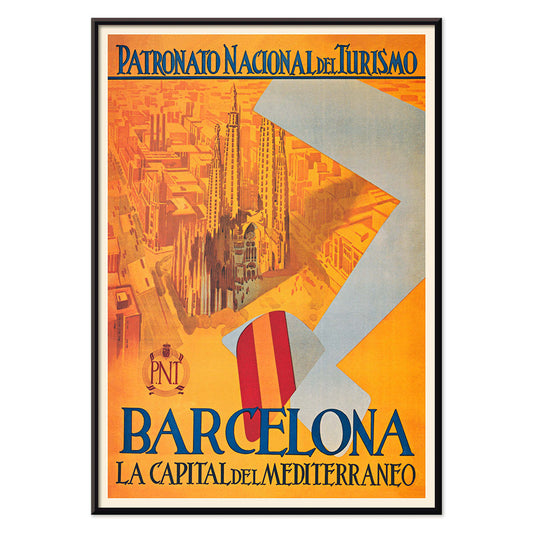
Capital del Mediterraneo Poster
Unknown artist · 1992 · Graphic Barcelona travel poster with stylized cityscape and bold blue, red accents
Poster from CHF 9 · Framed from CHF 16
Regular price From CHF 6.00Regular price -
Sevilla Fiestas de primavera 2 Poster
Unknown artist · 1932 · Vibrant Seville festival poster featuring a flamenco dancer above a stylized city skyline
Poster from CHF 9 · Framed from CHF 16
Regular price From CHF 6.00Regular price -
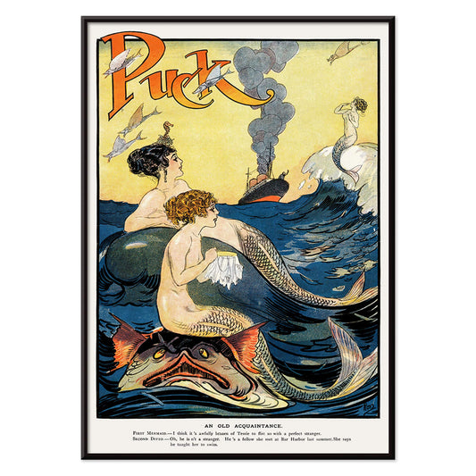
Mermaids sewing Poster
Unknown artist · 1911 · Whimsical mermaids poster with bold outlines and playful nautical fantasy
Poster from CHF 9 · Framed from CHF 16
Regular price From CHF 6.00Regular price -
Mexican Art & Life 4 Poster
Unknown artist · 1938 · Vibrant Mexican harvest poster with two field workers under a radiant sun
Poster from CHF 9 · Framed from CHF 16
Regular price From CHF 6.00Regular price -
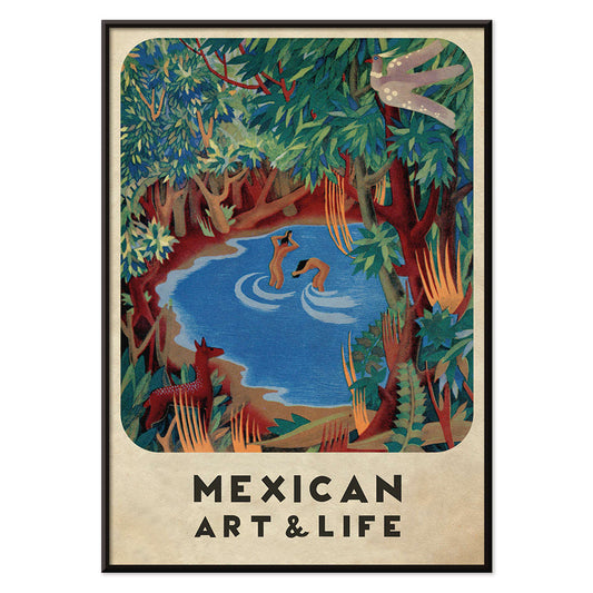
Mexican Art & Life 3 Poster
Unknown artist · 1938 · Modernist forest poster with playful animals and bold Mexican Art & Life typography
Poster from CHF 9 · Framed from CHF 16
Regular price From CHF 6.00Regular price -
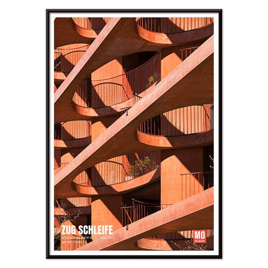
Zug Schleife Poster
Mo Art Gallery · 2023 · Graphic architectural poster with a looping geometric form in bold orange and black
Poster from CHF 9 · Framed from CHF 16
Regular price From CHF 6.00Regular price -
25th of April Bridge Poster
Mo Art Gallery · 2023 · Geometric Lisbon bridge poster balancing bold arcs, cables, and sunlit color blocks
Poster from CHF 9 · Framed from CHF 16
Regular price From CHF 6.00Regular price -
Joyful Mountain Poster
Paul Klee · 1929 · Joyful abstract mountain art print built from rhythmic color blocks and fine black lines
Poster from CHF 9 · Framed from CHF 16
Regular price From CHF 6.00Regular price -
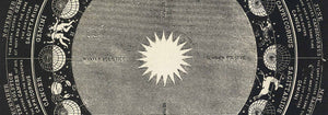
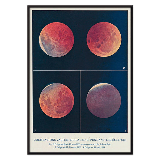
Colorations variées de la Lune Poster
Alphonse Berget · 1925 · Chartlike lunar eclipse scientific print showing moons shifting from white to copper red
Poster from CHF 9 · Framed from CHF 16
Regular price From CHF 6.00Regular price -
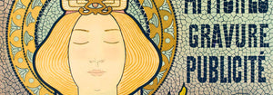
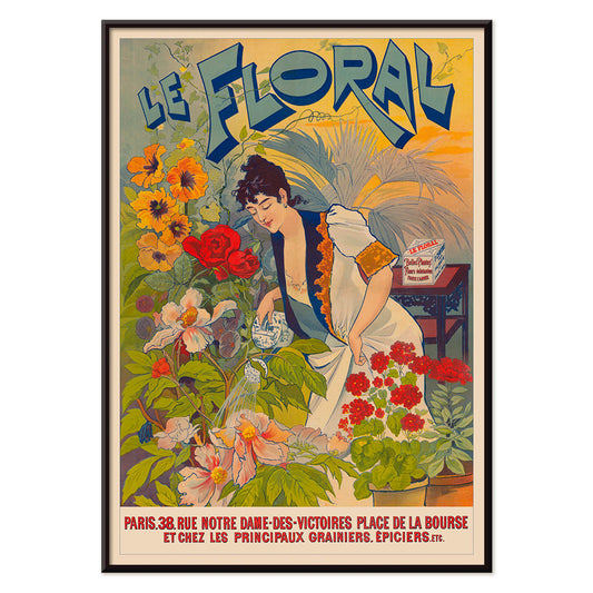
Le Floral Poster
Unknown artist · 1891 · Graceful Art Nouveau poster featuring a woman surrounded by colorful flowers and ornate lettering
Poster from CHF 9 · Framed from CHF 16
Regular price From CHF 6.00Regular price -
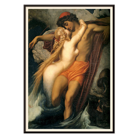
The Fisherman And The Syren Poster
Frederic Leighton · 1856 · Sensual mythological art print of a siren embracing a fisherman beside dark waters
Poster from CHF 9 · Framed from CHF 16
Regular price From CHF 6.00Regular price -
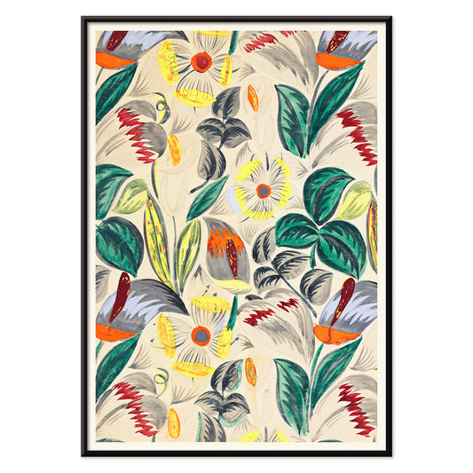
Tropical Flowers II Poster
Unknown artist · 1912 · Decorative tropical flower print with stylized foliage and warm early modern pattern rhythm
Poster from CHF 9 · Framed from CHF 16
Regular price From CHF 6.00Regular price -
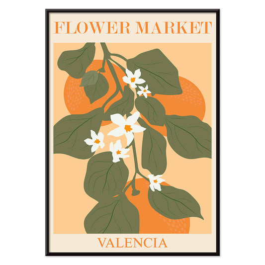
Flower Market Valencia Poster
MORYARTY · 2022 · Bright botanical poster of Valencia leaves and white blossoms on warm orange
Poster from CHF 9 · Framed from CHF 16
Regular price From CHF 6.00Regular price -
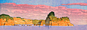
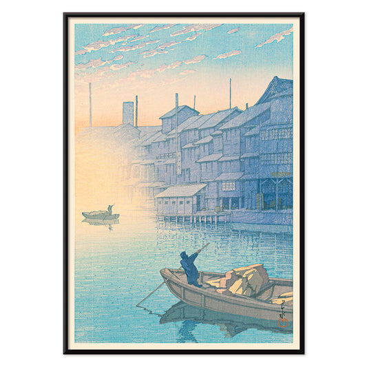
Morning at Dotonbori Poster
Kawase Hasui · 1935 · Tranquil riverside morning art print with soft reflections and quiet boats
Poster from CHF 9 · Framed from CHF 16
Regular price From CHF 6.00Regular price -
Flower Market Lisbon Poster
MORYARTY · 2019 · Sunlit Lisbon flower market poster with bold blooms and lush green leaves
Poster from CHF 9 · Framed from CHF 16
Regular price From CHF 6.00Regular price -
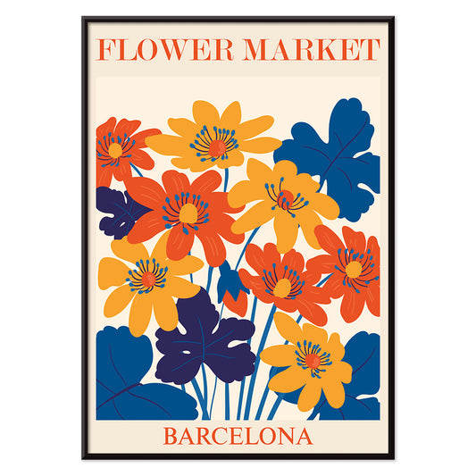
Flower Market Barcelona Poster
MORYARTY · 2022 · Vibrant floral tile motif poster with bold Mediterranean colors and clean geometry
Poster from CHF 9 · Framed from CHF 16
Regular price From CHF 6.00Regular price -
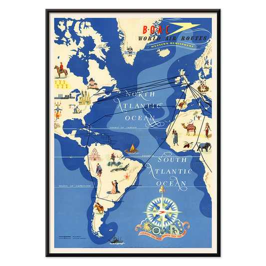
British Overseas Airways Poster
Seymour E.O. · 1949 · Colorful BOAC world routes poster with sweeping lines across a stylized globe
Poster from CHF 9 · Framed from CHF 16
Regular price From CHF 6.00Regular price -
Orange cut outs Poster
MORYARTY · 2022 · Abstract cut-out poster with orange shapes and green accents on warm beige
Poster from CHF 9 · Framed from CHF 16
Regular price From CHF 6.00Regular price -
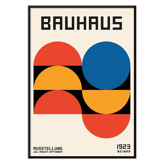
Bauhaus Poster 19 Poster
MORYARTY · 1923 · Geometric Bauhaus poster featuring balanced circles and squares in vivid primary colors
Poster from CHF 9 · Framed from CHF 16
Regular price From CHF 6.00Regular price -
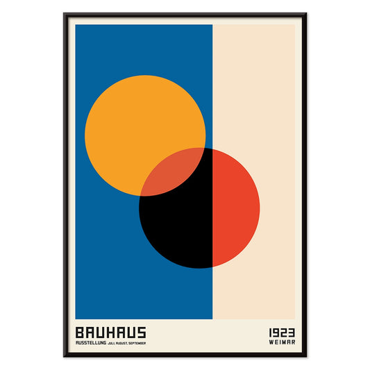
Bauhaus Poster 18 Poster
MORYARTY · 1926 · Geometric circles and bars poster in primary colors for crisp modernist walls
Poster from CHF 9 · Framed from CHF 16
Regular price From CHF 6.00Regular price -
Bauhaus Poster 17 Poster
MORYARTY · Geometric Bauhaus poster featuring intersecting circles and primary color accents on warm beige
Poster from CHF 9 · Framed from CHF 16
Regular price From CHF 6.00Regular price -
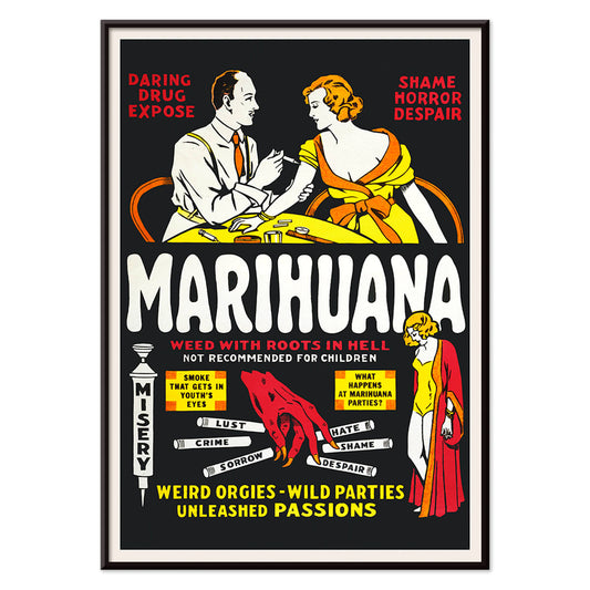
Marihuana Poster
Unknown artist · 1936 · Sensational anti-weed movie poster with fiery lettering and cautionary vignette scenes
Poster from CHF 9 · Framed from CHF 16
Regular price From CHF 6.00Regular price -
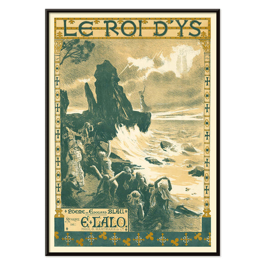
Le roi d'Ys Poster
Auguste François-Marie Gorguet · 1888 · Dramatic ocean scene poster with wind whipped waves and glowing coastal light
Poster from CHF 9 · Framed from CHF 16
Regular price From CHF 6.00Regular price -
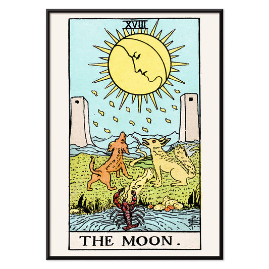
Tarot - The Moon 2 Poster
Rider Waite · 1910 · Mystical Moon tarot poster with twin canines, winding path, and dreamlike night palette
Poster from CHF 9 · Framed from CHF 16
Regular price From CHF 6.00Regular price -
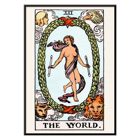
Tarot - The World Poster
Rider Waite · 1910 · Mystical tarot poster with dancing figure inside laurel wreath and four guardians
Poster from CHF 9 · Framed from CHF 16
Regular price From CHF 6.00Regular price -
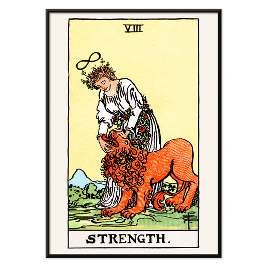
Tarot - Strength Poster
Rider Waite · 1910 · Symbolic Strength tarot poster featuring a calm maiden and lion beneath an infinity sign
Poster from CHF 9 · Framed from CHF 16
Regular price From CHF 6.00Regular price -
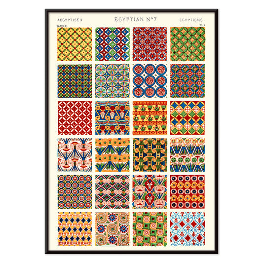
Egytian 7 Poster
Owen Jones · 1899 · Striking Egyptian pattern poster with layered geometric motifs in bold red and blue
Poster from CHF 9 · Framed from CHF 16
Regular price From CHF 6.00Regular price -
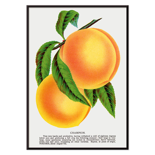
Champion plum Poster
Owen Jones · 1910 · Lush plum print featuring ripe orange fruit and green leaves on a pale background
Poster from CHF 9 · Framed from CHF 16
Regular price From CHF 6.00Regular price -
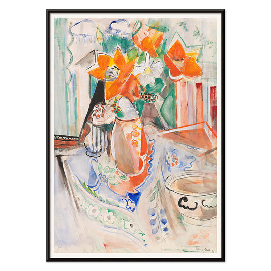
Floral still life with bowl Poster
Oskar Moll · 1902 · Vibrant floral still life poster balancing a bold bouquet with a grounded bowl
Poster from CHF 9 · Framed from CHF 16
Regular price From CHF 6.00Regular price -
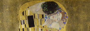
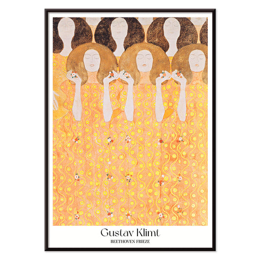
Beethoven Frieze Poster
Gustav Klimt · 1919 · Ornamental figure poster inspired by Beethoven Frieze with radiant gold and warm red accents
Poster from CHF 9 · Framed from CHF 16
Regular price From CHF 6.00Regular price -
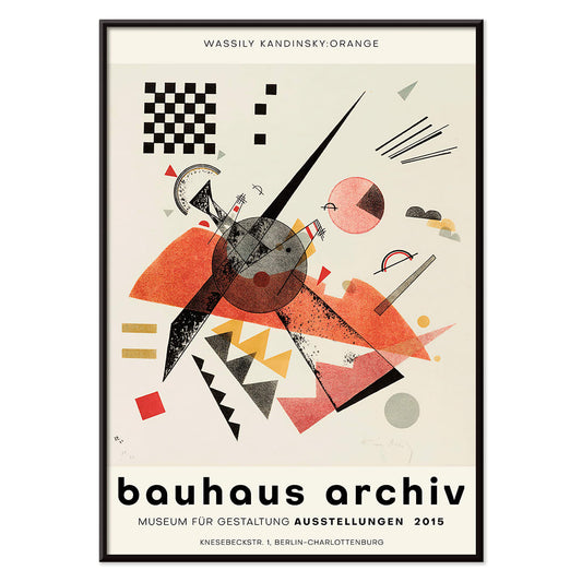
Orange Poster
Wassily Kandinsky · 1923 · Geometric orange poster balancing circles and sharp lines on an airy white ground
Poster from CHF 9 · Framed from CHF 16
Regular price From CHF 6.00Regular price -
Moresque 5 Poster
Owen Jones · 1899 · Vivid Moorish-inspired geometric poster with interlaced stars and bold color contrasts
Poster from CHF 9 · Framed from CHF 16
Regular price From CHF 6.00Regular price -
Persian 2 Poster
Owen Jones · 1899 · Persian-inspired geometric pattern poster with interlaced motifs in warm red, green, and beige
Poster from CHF 9 · Framed from CHF 16
Regular price From CHF 6.00Regular price -
Shakyamuni Buddha Poster
Unknown artist · 535 · Narrative Buddhist art print with Shakyamuni Buddha centered among vivid devotional scenes
Poster from CHF 9 · Framed from CHF 16
Regular price From CHF 6.00Regular price -
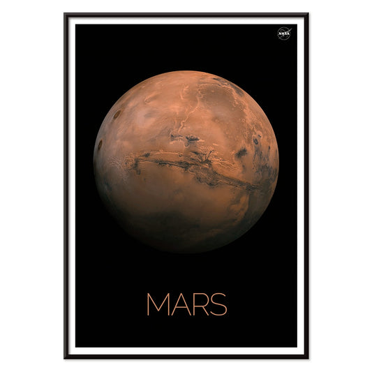
Mars Poster
NASA · 1976 · Iconic Mars poster featuring orange and ochre surface tones against a deep black background
Poster from CHF 9 · Framed from CHF 16
Regular price From CHF 6.00Regular price -
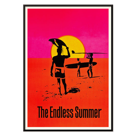
The Endless Summer Poster
Unknown artist · 1966 · Iconic surf poster with black surfer silhouettes crossing a glowing sunset circle
Poster from CHF 9 · Framed from CHF 16
Regular price From CHF 6.00Regular price -
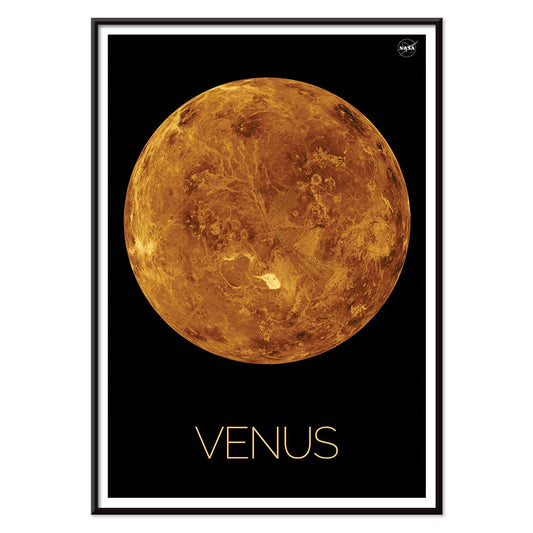
Venus Poster
NASA · 1972 · Retro Venus poster featuring bold orange planet tones and minimalist space age design
Poster from CHF 9 · Framed from CHF 16
Regular price From CHF 6.00Regular price -
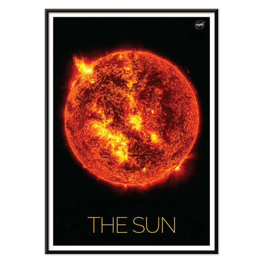
The Sun 3 Poster
NASA · 2019 · Fiery solar surface poster with arcing flares in orange and yellow on black
Poster from CHF 9 · Framed from CHF 16
Regular price From CHF 6.00Regular price -
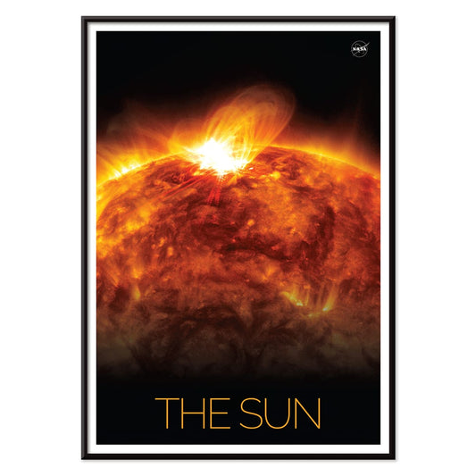
The Sun 1 Poster
NASA · 2019 · Intense solar flare poster capturing the Sun’s churning surface against deep space
Poster from CHF 9 · Framed from CHF 16
Regular price From CHF 6.00Regular price -
Solar Surfing Poster
NASA · 1979 · Geometric space poster of a spacecraft surfing solar arcs in warm sunrise tones
Poster from CHF 9 · Framed from CHF 16
Regular price From CHF 6.00Regular price


72/340 items
- Shaw or Irony Poster
- Carrots Poster
- Les Lalanne Poster
- Jet Clipper to Hawaii Poster
- Kohler Chocolat Poster
- Tom Krojer Exhibition Poster Poster
- Berlin Street Scene Poster
- Park Near Lu Poster
- Parler Seul 2 Poster
- Faun and Nymphe Poster
- The Dream Poster
- Le Concert Poster
- Female Artist Poster
- Revenge of the Pink Panther Poster
- Almanaque Poster
- Bauhaus 21 Poster
- The Jefferson Airplane Poster
- Butter Poster
- Pacific Vibrations Poster
- Continental Hawaii Airline Poster
- Sherlock Holmes Poster
- Beer and Cigarette Poster
- Mexican Art & Life 4 Poster
- Mexican Art & Life 3 Poster
- Zug Schleife Poster
- 25th of April Bridge Poster
- Joyful Mountain Poster
- Colorations variées de la Lune Poster
- Le Floral Poster
- Tropical Flowers II Poster
- Flower Market Valencia Poster
- Morning at Dotonbori Poster
- Flower Market Lisbon Poster
- Flower Market Barcelona Poster
- British Overseas Airways Poster
- Orange cut outs Poster
- Bauhaus Poster 19 Poster
- Bauhaus Poster 18 Poster
- Bauhaus Poster 17 Poster
- Marihuana Poster
- Tarot - The Moon 2 Poster
- Tarot - The World Poster
- Champion plum Poster
- Beethoven Frieze Poster
- Orange Poster
- The Endless Summer Poster
Orange as a Temperature
Orange is less a subject than a sensation: late-afternoon light on paper, oxidised inks, the glow of citrus peel. In this collection, colour becomes a guide through poster history, from modernist studies to travel graphics and vintage illustration, chosen for orange notes that warm decoration without taking over. It is a practical palette tool for home decor, echoing terracotta tiles, leather, brass, or a single linen cushion, while the compositions stay varied and surprising. Oranges run from burnt sienna to soft tangerine, often set against cream stock or deep ink, giving each print a depth that reads well across different rooms.
From Colour Theory to Modernist Graphics
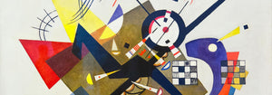
Some of the most persuasive oranges arrive through theory rather than motif. Chevreul’s Cercle chromatique turns pigment into geometry, a nineteenth-century diagram that still feels contemporary in its clarity. That analytical spirit links naturally to abstract work and the sharp pedagogy of bauhaus, where colour and form were treated as a language. In Kandinsky’s 1923 Bauhaus exhibition poster, orange blocks and angled lines act like structure you can hear, with warmth held in disciplined balance. Paul Klee takes the opposite route: The Harbinger of Autumn (1922) lets orange seep through watery forms, closer to weather than signage.
Interior Guidance for Orange Wall Art
In interiors, orange works best when it has a counterweight. In kitchens or dining corners, pair citrus tones with chalky whites and matte black hardware; if you like a more engineered note, a scientific art print aligned with space such as NASA’s Deep Space Atomic Clock brings crisp lines that keep warmth from feeling sugary. In bedrooms, choose softer apricot and rust notes and let materials do the heavy lifting: oatmeal textiles, walnut, and amber glass. If your walls already carry strong colour, introduce orange through line and negative space, or soften it by mixing with botanical prints where paper tone and fine drawing create breathing room.
Curating Pairings, Frames, and Gallery Walls
When building a gallery wall, treat orange as rhythm rather than a single statement. Alternate a warm print with something cooler so the eye keeps moving: green plants, indigo textiles, or blue ceramics work as natural foils. Lithographic posters from advertising often carry the richest oranges, because the process favoured saturated inks and clear silhouettes; they tend to sit well in slim oak or dark-stained frames, depending on whether you want the hue to glow or to anchor. For an intimate counterpoint, bring in figure drawing: Schiele’s Kneeling Female in Orange-Red Dress (1910) is all tense contour and exposed paper, with the fabric acting like a flare against restraint, especially effective near bookshelves or a writing desk.
Why Orange Keeps Returning
Across the twentieth century, orange served both persuasion and possibility: a café sign, a railway sunset, a modernist diagram promising order. As wall art, it behaves like a controlled source of heat, useful when rooms lean grey, beige, or concrete. These vintage prints let you borrow that warmth in measured doses, from calibrated circles to loose watercolour stains, without forcing a full colour scheme.