


You may also like
-
Farbstudien, 10 Blätter IV Poster
Karl Wiener · 1923 · Luminous abstract watercolor art print with layered color fields in blue, purple, and yellow
Poster from CHF 9 · Framed from CHF 16
Regular price From CHF 6.00Regular price -
Farbstudien, 10 Blätter VIII Poster
Karl Wiener · 1923 · Fluid abstract art print with warm yellow washes and deep purple currents
Poster from CHF 9 · Framed from CHF 16
Regular price From CHF 6.00Regular price -
Farbstudien, 10 Blätter I Poster
Karl Wiener · 1923 · Energetic abstract poster balancing orange and green forms on warm beige
Poster from CHF 9 · Framed from CHF 16
Regular price From CHF 6.00Regular price -
Farbstudien, 10 Blätter X Poster
Karl Wiener · 1923 · Modernist abstract art print featuring geometric shapes in muted blue, ochre, and black
Poster from CHF 9 · Framed from CHF 16
Regular price From CHF 6.00Regular price


-

"Very nice Posters. The quality is amazing and we received it very quickly !"
-

"A shop to visit absolutely. Huge selection of posters. We spent more than an hour there !"
-

"Perfect to find gift. Price are very good. An they can frame and pack it on site"


About the Artist
Karl Wiener was a Viennese artist active during the vibrant interwar period, a time when European modernism encouraged artists to move beyond traditional representation and explore new visual languages. Through his work in watercolor, drawing, and graphic design, Wiener developed a refined sense of balance and form, contributing to the evolving landscape of abstraction in Central Europe.
Wiener approached abstraction not as a riddle to solve, but as a way to express rhythm and mood. His sensitivity to color and composition places his work among the thoughtful experiments of his era, making it resonate with both historical and contemporary audiences.
The Artwork
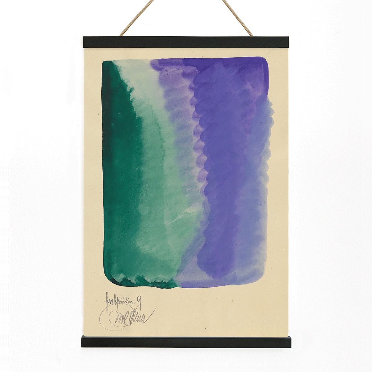
Created in 1923, Farbstudien, 10 Blätter IX is part of a series of color studies that artists often produced for their own exploration. In the aftermath of World War I, many artists turned to color theory and abstraction to rebuild visual meaning from the ground up. These studies were not intended for public display, but rather as private exercises in understanding the emotional and perceptual effects of color.
This piece reflects the spirit of experimentation and renewal characteristic of the early 1920s, offering insight into how artists like Wiener sought harmony and innovation through pure color relationships. It stands as a testament to the enduring power of abstract art to evoke feeling and contemplation.
Style & Characteristics
This abstract watercolor features softly blended areas of green and violet that float on a warm beige background. The transparent washes create gentle transitions, with no harsh lines separating the colors. The composition feels calm and meditative, allowing the paper itself to play an active role in the overall effect.
The subtle layering and measured structure give the piece a quiet modernist rhythm. If you are interested in abstract wall art or works influenced by the Bauhaus movement, this fine art print offers a nuanced and intimate approach. It also complements selections from the green and purple collections for a cohesive palette.
In Interior Design
This artwork is well-suited for living rooms, hallways, or home offices where you want to introduce color in a subtle, sophisticated way. Its restrained composition pairs beautifully with modern, Scandinavian, or Japandi interiors, and it can also add a touch of 1920s innovation to more classic spaces.
Consider displaying it alongside natural wood, linen, or matte white walls, drawing accent colors from its green and purple tones. It works harmoniously within a curated gallery wall of minimalist posters and vintage abstract art prints, enhancing the atmosphere with its gentle presence.