About the Artist
F.E. Manning was active during a pivotal period in American graphic design, contributing to the visual language of wartime communication. His work for the Army Orientation Course in 1940 exemplifies the era’s drive to inform and motivate through clear, impactful visuals. Manning’s posters were designed to distill complex information into accessible formats for both military personnel and the public, reflecting the urgency and clarity demanded by World War II.
Today, his legacy endures among collectors and enthusiasts of vintage educational and military graphics, where his blend of function and style is especially prized.
The Artwork
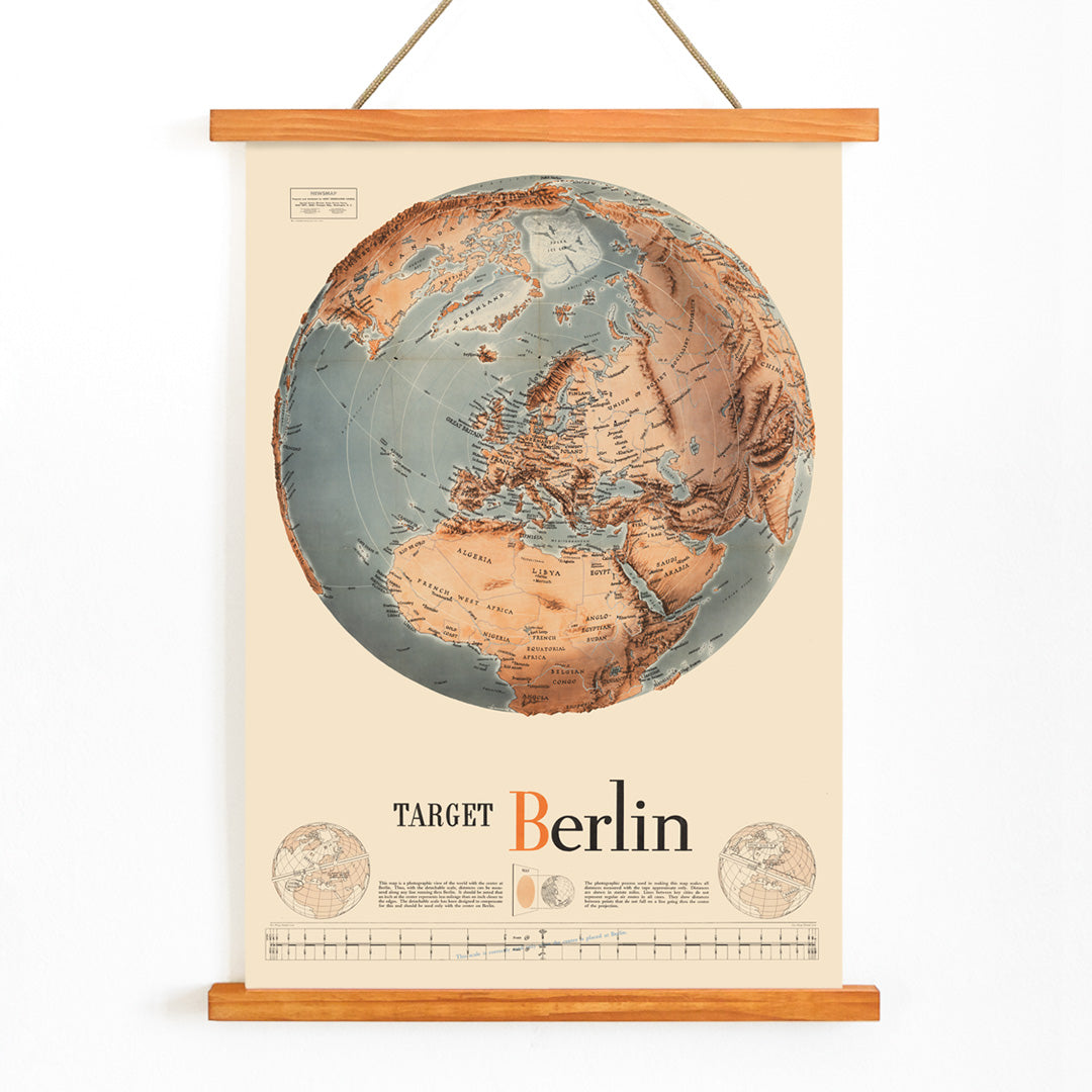
This Army Orientation Course poster was created in 1940 as part of a broader effort to educate and orient troops during World War II. Such materials were crucial for transforming abstract geography into actionable knowledge, helping soldiers visualize strategic objectives and the broader context of the conflict. The poster’s focus on Berlin as a target underscores the high stakes and central goals of the Allied campaign, serving both as a teaching tool and a morale booster.
Viewed now, it stands as a historical artifact from a time when visual communication played a vital role in shaping understanding and unity during global conflict.
Style & Characteristics
The composition features a stylized globe map at its center, surrounded by bold, legible instructional text. A prominent target graphic highlights Berlin, drawing immediate attention to the poster’s central message. The design employs a disciplined palette of beige background, deep blue accents, and warm orange highlights, creating strong visual contrast and clarity.
The overall effect is brisk and purposeful, embodying the directness of WWII-era instructional posters. The clean lines, simplified forms, and strategic use of color make it both visually striking and easy to interpret, lending a documentary quality that resonates in contemporary interiors.
In Interior Design
This vintage map poster is well suited to studies, offices, libraries, or any space where focus and historical narrative are valued. Its documentary style complements industrial, mid-century modern, and minimalist interiors, and it can add a purposeful accent to an eclectic gallery wall.
Pair it with natural wood, black metal frames, and decor in blue or muted orange for a cohesive look. For similar themes, explore map wall art, blue tone posters, and curated horizontal posters.


