


You may also like
-
Cercle chromatique Poster
Michel Eugène Chevreul · 1861 · Classic scientific print of a chromatic circle mapping harmonious hue relationships
Poster from CHF 9 · Framed from CHF 16
Regular price From CHF 6.00Regular price -
Historic Ornament Poster
Elizabeth A. Nedwill · 1900 · Vivid geometric ornament vintage print balancing historic pattern with modern rhythm
Poster from CHF 9 · Framed from CHF 16
Regular price From CHF 6.00Regular price -
Solaris Poster
Unknown artist · 1972 · Hypnotic cosmic poster with orbiting forms and bold red-blue contrasts
Poster from CHF 9 · Framed from CHF 16
Regular price From CHF 6.00Regular price -
Prismatic Color Wheel Poster
Moses Harris · 1766 · Enlightenment color wheel print featuring radiant primary and secondary hues in a precise arrangement
Poster from CHF 9 · Framed from CHF 16
Regular price From CHF 6.00Regular price


-

"Very nice Posters. The quality is amazing and we received it very quickly !"
-

"A shop to visit absolutely. Huge selection of posters. We spent more than an hour there !"
-

"Perfect to find gift. Price are very good. An they can frame and pack it on site"


About the Artist
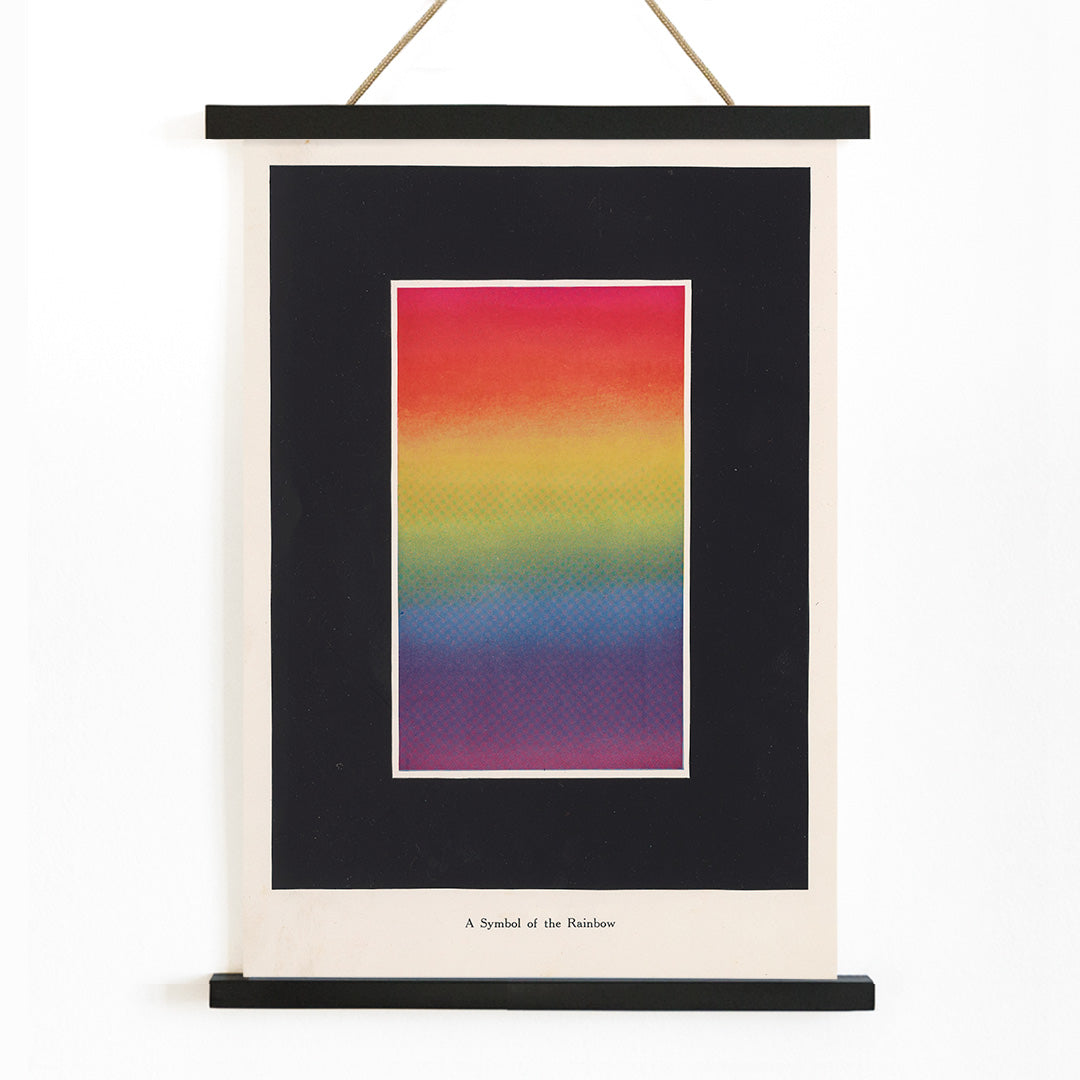
Bonnie E. Snow was an influential early twentieth-century educator and author, known for her work in making color theory accessible to students and professionals alike. In 1918, as new scientific approaches to art education emerged, Snow contributed to the growing field by developing instructional materials that bridged the gap between creative intuition and systematic study. Her work reflects the era’s fascination with applying principles from optics and psychology to the visual arts.
Snow’s approach to teaching color anticipated later design movements, such as those represented in Bauhaus inspired design posters, where clarity, structure, and the interplay of hue became central to both education and aesthetics.
The Artwork
The Theory and Practice of Color was created during a period when structured visual education was gaining ground in art schools and industry. This 1918 chart served as a practical tool for teaching the relationships between primary and secondary colors, helping artists, printers, and designers achieve consistent results. Its purpose was to demystify color harmony and make the science of color accessible to a wider audience, including those in advertising and manufacturing.
As a historical teaching aid, this piece stands as a testament to the early modern belief that visual knowledge could be systematized and shared, reflecting a broader cultural shift toward rationality and progress in the arts.
Style & Characteristics
The image features a clean, diagrammatic composition: a luminous spectrum arcs smoothly from red through yellow, green, blue, and violet, set against a pale background. Clear, dark typography labels each color, and the spacing is precise, emphasizing legibility and order. The overall effect is both analytical and uplifting, with the rainbow gradient providing a sense of optimism and clarity.
This vintage poster’s mood is bright yet composed, making it a striking example of early educational graphic design. It pairs well with abstract art prints and other modernist works, and its structured layout complements contemporary interiors.
In Interior Design
This vintage color theory poster serves as a vibrant focal point in studios, classrooms, or creative workspaces, offering both inspiration and historical interest. Its bold gradient draws the eye, making it suitable for display above desks, in hallways, or as part of a gallery wall.
Framing it in black or white enhances its clarity, while pairing it with neutral furnishings allows the spectrum to stand out. It also harmonizes naturally with science themed wall art, bringing a touch of educational heritage to modern interiors.