


You may also like
-

Bananes (Musa) Poster
Ellen Isham Schutt · 1904 · Lumineuse impression botanique de bananes avec ombrages délicats et fond clair aérien
Poster dès CHF 9 · Encadré dès CHF 16
-

Margarine Axa Poster
Leonetto Cappiello · 1931 · Poster Margarine Axa audacieux avec personnage marquant, fond vert et touches jaunes ensoleillées
Poster dès CHF 9 · Encadré dès CHF 16
-

Cirkelkaffe Poster
J.Olséns · 1945 · Poster graphique de café avec personnage au large chapeau devant campagne verte
Poster dès CHF 9 · Encadré dès CHF 16
-

Ib Geertsen Poster
Ib Geertsen · 1982 · Poster géométrique vibrant équilibrant larges blocs primaires et modernisme scandinave net
Poster dès CHF 9 · Encadré dès CHF 16


-

'Très beaux posters. La qualité est incroyable et nous les avons reçus très vite !'
-

'Une boutique incontournable. Un choix énorme de posters. On y a passé plus d'une heure !'
-

'Parfait pour trouver un cadeau. Les prix sont très corrects. Et ils peuvent l'encadrer et l'emballer sur place'


L'artiste
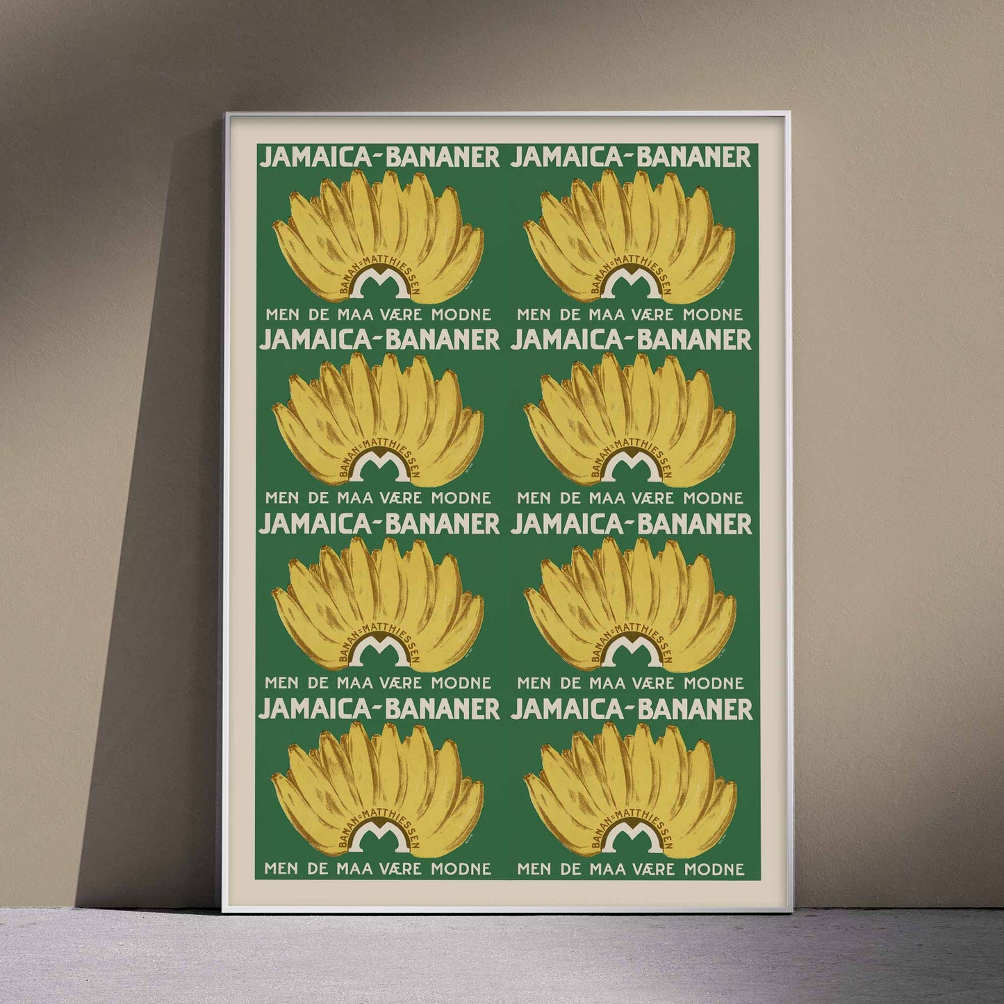
Créée par un artiste anonyme, cette publicité de 1920 transforme les bananes de Jamaïque en promesse directe adressée aux consommateurs. Le nom du produit et la formule danoise MEN DE MAA VÆRE MODNE, qui signifie 'mais elles doivent être mûres', insistent sur la qualité attendue au moment de l'achat. Un petit emblème circulaire placé sous chaque régime renforce l'identité commerciale de l'affiche, bien qu'aucun créateur ne soit mentionné. Ce document témoigne du commerce alimentaire de l'entre-deux-guerres, lorsque les bananes étaient présentées comme un produit importé dont l'origine et la maturité constituaient les principaux arguments de vente.
L'œuvre
La campagne associe un achat quotidien à une provenance lointaine. En citant la Jamaïque, l'annonceur fait de l'origine un élément central du message, tandis que l'exigence de maturité fixe une attente claire pour le vendeur comme pour le client. Le texte répond ainsi à un objectif pratique, plutôt qu'à une intention commémorative ou seulement décorative. Les bananes apparaissent comme une denrée importée fiable, intégrée au commerce courant. Cette fonction donne à l'affiche vintage sa valeur historique : elle montre comment la publicité alimentaire s'adressait aux consommateurs danois en 1920 et retrace un lien précis entre approvisionnement maritime et épiceries locales.
Le message ne se contente pas d'indiquer une origine géographique. Il associe aussi le fruit à un moment précis de sa consommation, en rappelant que la maturité détermine sa qualité. La répétition des régimes rend cette information immédiatement visible et transforme l'affiche en support de mémorisation. Dans une épicerie, son format vertical et son contraste chromatique devaient attirer l'attention depuis l'autre côté du magasin, tout en laissant le texte lisible à distance.
Style et caractéristiques
Sur un fond vert profond, huit régimes de bananes dorées se répètent en deux colonnes régulières. Chaque grappe s'ouvre en éventail, avec un dessin brun qui délimite les fruits et leurs tiges. Les lettres crème s'insèrent entre les images et rendent le message danois parfaitement lisible sans interrompre le motif. Le regard descend le long d'une colonne, puis rejoint la suivante en suivant l'emblème placé sous chaque régime. Le jaune domine l'affiche vintage, tandis que le vert lui donne une profondeur dense et végétale. Une fine bordure beige encadre la composition. Les aplats d'encre et la palette réduite inscrivent nettement cette œuvre dans le graphisme publicitaire des années 1920.
La composition repose sur une organisation presque modulaire. Les grappes, les emblèmes et les blocs de texte se répondent avec une régularité qui évoque la mise en page des emballages et des étiquettes commerciales. Pourtant, les contours irréguliers des fruits conservent une présence naturelle. Le contraste entre la géométrie de l'ensemble et le volume suggéré par les ombres brunes donne à l'affiche une énergie simple, adaptée à un message destiné à être compris en un coup d'œil.
Dans la décoration
Dans une cuisine lumineuse, ce poster vertical peut prendre place au-dessus d'une table de petit-déjeuner en chêne, où ses proportions élancées guident le regard vers le haut. Un cadre noir simple reprend le contour sombre de l'impression sans rivaliser avec les fruits. Le fond vert peut dialoguer avec quelques herbes en pot, tandis que les régimes jaunes contrastent avec un mur clair. La répétition du texte et des images apporte un rythme graphique mesuré à l'espace, tout en rappelant l'histoire du commerce alimentaire.